Mastercard Branding Requirements
As of 1 November 2018, Mastercard announced the next step in its brand evolution. Given the global recognition of the red and yellow interlocking circles, the full-color Mastercard Brand Mark, without the word “mastercard” (referred to as the Mastercard Symbol), is featured on cards, merchant websites, and decal stickers.
Recent updates:
Access Marks (effective 1 January 2021), Mastercard introduces revised standards for the display of the Mastercard®, Maestro®, and Cirrus® Brand Marks in relation to access marks displayed. An access mark is a mark that identifies a service that enables access to and/or acceptance of a Mastercard, Maestro, or Cirrus account.

Mastercard Branding Requirements
1. Choose the correct Mastercard branding (“logo”) for your specific use. See Configurations for more guidance.

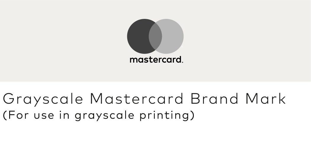
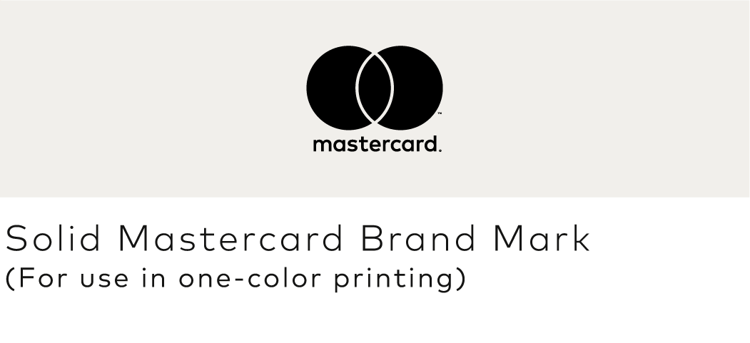
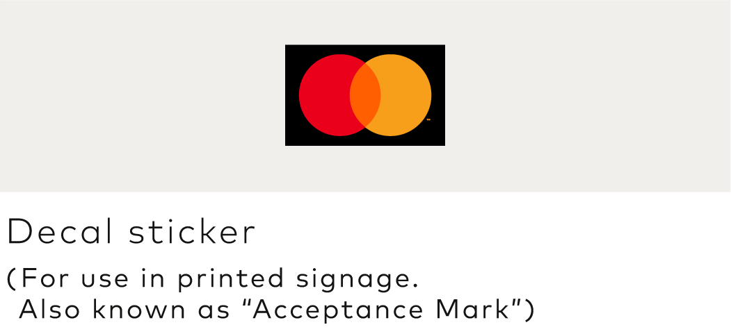
*For a limited time period, in specified select markets, Mastercard permits the full-color Mastercard Brand Mark to be used at merchant locations (physical, websites, and apps) to signal acceptance and in marketing materials to market and promote Mastercard products and services. If you need further guidance on which Mastercard branding to use, please consult your Mastercard Representative or contact us.
2. Always provide sufficient contrast with the background. See Background contrast.




3. Always surround the logo with sufficient clear space. See Minimum clear space.

4. For cards, please get guidelines and artwork from the Card Design Standards at mastercardconnect.com
5. Always reproduce the logo at a size that is clear and legible. See Minimum size.
6. When referencing Mastercard® in text, use an uppercase “M” and lowercase “c”, with no space between “Master” and “card”. See Using the Mastercard name in text.
Mastercard Symbol
The Mastercard Symbol is comprised of the Mastercard circles and associated trademark symbol ™ without the word "mastercard®." The Symbol is used at merchant locations (physical, websites, and apps) to signal acceptance and in marketing materials to market and promote Mastercard products and services.
- The Symbol must be used in full color only. See Color specifications.
- The Symbol must never be used in grayscale or other colors. (Instead, use the grayscale or solid Mastercard Brand Mark as noted in the next section.)
- Artwork is available for download and must not be altered.
- Download artwork for cards at mastercardconnect.com.
Note: When used to signify acceptance, the Symbol may also be referred to as an Acceptance Mark.
Mastercard Brand Mark
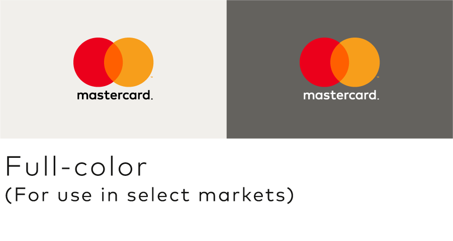
For a limited time period, in specified select markets, Mastercard permits the full-color Mastercard Brand Mark to be used at merchant locations (physical, websites, and apps) to signal acceptance and in marketing materials to market and promote Mastercard products and services. If you need further guidance on which Mastercard branding to use, please consult your Mastercard Representative or contact us.
The Mastercard Brand Mark is comprised of the Mastercard circles and associated trademark symbol ™ and the word “mastercard” followed by a registered trademark symbol ®.
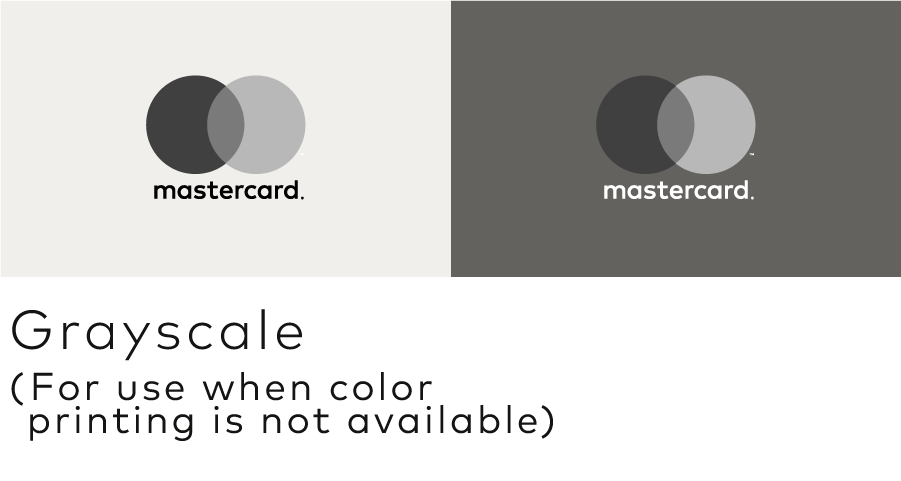
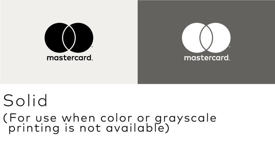
The grayscale and solid versions of the Mastercard Brand Mark are also used in marketing materials when printing methods prohibit the use of the full-color Symbol artwork.
The Mastercard Brand Mark is available in both vertical and horizontal configurations. Use the one that best fits your needs.
- Full-color, grayscale, and solid versions are available for use on white or light backgrounds (“positive”) and black or dark backgrounds (“reverse”). See Color specifications.
- Grayscale and solid versions must never be used on the chip side for physical cards or the visible side when a card is represented visually in any digital payment environment.
- Artwork is available for download and must not be altered.
- Download artwork for acceptance and marketing here.
- Download artwork for cards at mastercardconnect.com.
VERTICAL CONFIGURATION
HORIZONTAL CONFIGURATION


Note: The ™ and / or ® trademark symbols (or other symbol required under local law) must be used. They must remain at the relative size provided in the authorized artwork files and be scaled proportionally with the marks even though their legibility may be compromised when the marks are at very small sizes or reproduced in certain media. The trademark symbols (or other symbol required under local law) must not be enlarged independently to increase legibility.
Decal stickers
- The decal sticker (also known as the “Acceptance Mark”) is comprised of the Mastercard Symbol on a specifically-sized black background.
- Decal stickers are physically printed signage used to signify acceptance at retail locations such as on door decals, card terminals, or ATMs.
- Decal stickers and other signage must not be printed in grayscale.
- Artwork is available for download and must not be altered.

Not all configurations of Mastercard branding are available in all color versions.
- The Mastercard Symbol must be used in full-color only. When technical limitations prohibit the use of full-color, use the solid or grayscale Mastercard Brand Mark.
- On physical cards, the Mastercard Symbol must be printed in full-color match PANTONE®* only. For more details, refer to the Card Design Standards published on mastercardconnect.com
- When depicting cards in digital payments/wallets the Mastercard Symbol must always be in full color using the provided RGB or Hex values.
- The decal sticker is available in full-color only and must be reproduced in full-color match PANTONE only.
- Colors are built into the downloadable artwork files and must not be altered.
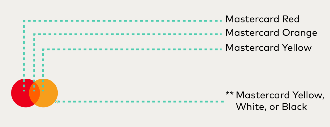
COLOR
RGB: 235/0/27
HEX: EB001B
CMYK: 0/100/98/3
PANTONE: 2035 C
Mastercard Orange
RGB: 255/95/0
HEX: FF5F00
CMYK: 0/75/100/0
PANTONE: 165 C
Mastercard Yellow
RGB: 247/158/27
HEX: F79E1B
CMYK: 0/44/100/0
PANTONE: 1375 C
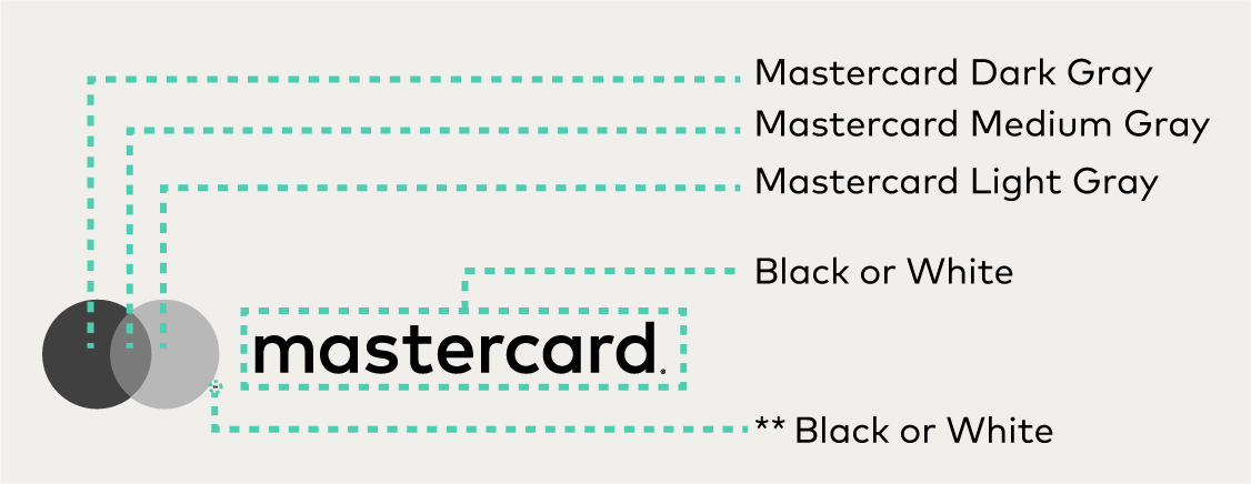
GRAYSCALE AND SOLID
CMYK: 0/0/0/75
Mastercard Medium Gray
CMYK: 0/0/0/52
Mastercard Light Gray
CMYK: 0/0/0/28
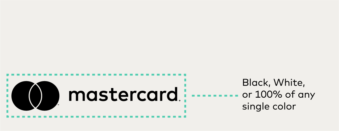
Note: Color specifications apply to vertical configurations as well.
*
The color values shown here have not been evaluated by Pantone, Inc. for accuracy and may not match the PANTONE Color Standard. Consult correct PANTONE Color Publications for accurate color. PANTONE® is the property of Pantone, Inc.
**
For online/digital RGB use or PANTONE printing, the trademark symbol (™) next to the yellow circle must be reproduced in Mastercard Yellow. For CMYK printing, the trademark symbol (™) must be black for the positive mark or white for the reverse mark. For all uses, the registered trademark symbol (®) to the right of the word “mastercard®” must be black for the positive mark or white for the reverse mark.
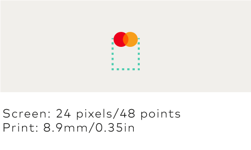
To ensure legibility of Mastercard branding, never use the logos at sizes smaller than the minimum size requirements.

Mastercard branding must appear in an uncluttered space free from text and other graphics.
- Surround the Mastercard Symbol with clear space of at least 1/4 the width of one of the circles within the Symbol.

Sufficient contrast between the background and the Mastercard branding is required.


Lettercase
When referencing Mastercard® in text, use an uppercase “M” and lowercase “c” with no space between “Master” and “card”. The name must not appear with a capital “C”. Mastercard must appear in the same font as its surrounding text. The name must not be modified in any way. The name may appear in all uppercase letters only if the font style of the user interface or communication also appears in all uppercase letters.


Registered trademark symbol (®)
In the first or most prominent text use of the word "Mastercard" on a page or screen (after use, if any, in a headline), the ® trademark symbol (or other symbol required under local law) is required. In subsequent use on that page or screen, the ® trademark symbol may be omitted.
Note: The ® trademark symbol is not necessary when referencing the company entity Mastercard.
Read-through
Mastercard branding may be used as a read-through in a headline, but may not be used as a read-through in the body of a communication. When used in text, it must be set in the same typeface as the surrounding text.


Trademark attribution notice
When the Mastercard, Maestro, or Cirrus name and/or Mastercard Symbol or Mastercard, Maestro, or Cirrus Brand Mark are used, the following trademark attribution notice must be included once in the communication, as applicable:
- “Mastercard and the circles design are registered trademarks of Mastercard International Incorporated.”
- “Maestro and the circles design are registered trademarks of Mastercard International Incorporated or its affiliates.”
- “Cirrus and the circles design are registered trademarks of Mastercard International Incorporated.”
If the Mastercard Symbol appears without the mention of the word “Mastercard” in the body copy of the communication, the following trademark attribution notice must be used instead: “The Mastercard circles design is a registered trademark of Mastercard International Incorporated.”
Note: On digital communications and small-size marketing communications, a trademark attribution notice is not required.
Translations
The Mastercard name must appear in English only. The Mastercard name must not be translated into other languages nor appear in another alphabet except for specific authorized versions in Chinese (translation), Arabic (transliteration), and Georgian (transliteration).
Parity
In communications that promote more than one acceptance mark, the Mastercard name and/or branding must be presented with size, frequency, color treatment, location, and prominence equal to that of all other acceptance marks and/or logos presented.
Note: As used on brand.mastercard.com, an access mark is any name, logo, sound, haptic, visual depiction, trade name, logotype, trademark, service mark, trade designation, and/or other designation, symbol or mark not licensed by Mastercard, that identifies a service through which a Mastercard, Maestro, or Cirrus account can be accessed and/or accepted for a Mastercard, Maestro, or Cirrus transaction.
All Mastercard® branding, including the decal stickers, must be displayed at the point of interaction where payment options and/or access marks are presented.
At the point of interaction, Mastercard branding must be displayed at parity (in terms of size, frequency, color treatment, and location) with all other acceptance marks displayed, with Mastercard preferably in the first position.
At the point of interaction, Mastercard branding, including the decal stickers, must be afforded similar prominence to any access mark displayed (characteristics to consider for similar prominence, include size, frequency, color treatment, and co-location within the same field of vision), except in the e-commerce environment as follows. In a digital environment, when displaying an access mark checkout option, Mastercard branding is not required to be displayed if (1) the cardholder can readily navigate from the screen displaying the access mark checkout option to a screen displaying a checkout option where the Mastercard branding is appropriately displayed or (2) Mastercard branding is appropriately displayed prior to payment confirmation, when use of an access mark checkout option is the only available checkout option. Access mark marketing materials (i.e., promotional signage, checkout lane dividers, etc.) are not required to include Mastercard branding.
Illustrative, but not exhaustive, examples of compliant displays follow.
General


Note: All point of interaction (POI) locations that accept Mastercard must display a Mastercard Mark at parity (in terms of size, frequency, color treatment and location) with all other acceptance marks (with the exception of Mastercard POI locations in the U.S., where a specific regional Standard that permits otherwise exists. Refer to Mastercard Rules, Rule 5.12.1 “Discrimination” of Chapter 16, “Additional U.S. Region and U.S. Territory Rules”).
Note: Gray boxes in the examples of displays represent a payment option or access mark, as applicable. As used on brand.mastercard.com, an access mark is any name, logo, sound, haptic, visual depiction, trade name, logotype, trademark, service mark, trade designation, and/or other designation, symbol or mark not licensed by Mastercard, that identifies a service through which a Mastercard, Maestro, or Cirrus account can be accessed and/or accepted for a Mastercard, Maestro, or Cirrus transaction.
Use at physical merchant locations
For complete information, refer to Use at physical merchant locations.
Use at digital merchant locations
For complete information, refer to Signaling digital payment acceptance.
Mastercard family of brands
When more than one Mastercard brand is accepted, display the marks horizontally or vertically in the approved sequence:
- Mastercard®
- Maestro®
- Cirrus®
Refer to the Other Marks section for artwork and requirements.
Note: Beginning 1 November 2018, the full-color Mastercard Brand Mark without the word “mastercard®” is featured on cards. This Mastercard Symbol branding is required on all physical cards manufactured on or after 1 July 2020.
Refer to the Card Design Standards published on mastercardconnect.com
Note: Mastercard Symbol branding is required on all physical cards manufactured after 1 July 2020.
All use of card images in marketing materials must comply with the requirements specified in the Card Design Standards manual published on mastercardconnect.com, and the requirements below:
- The card image must include Mastercard branding on the chip side for physical cards or the visible side when a card is represented visually in any digital payment environment in compliance with the Card Design Standards in full-color and at the exact size as it would appear on the actual card plastic.
- The entire chip side for physical cards or the visible side when a card is represented visually in any digital payment environment (including the entire Mastercard branding) must be fully visible, clear, and legible.
- The display of account information is optional. If included, the account information (the Primary Account Number (PAN), the effective date and/or expiration date, and the cardholder name) and all card face design requirements must be in accordance with the requirements set forth in the Card Design Standards.
- When a cardholder name is present on the card image, the issuer must use the name M. Molina in the Latin America and the Caribbean Region or the name Lee M. Cardholder or John M. Cardholder in all other Regions.
- When a PAN is present on the card image:
- For Mastercard cards, either a bank identification number (BIN) assigned to the issuer by Mastercard or 541275 or 222100 followed by any combination of digits up to 16 digits must be present on the card image.
- For Maestro cards, either a BIN assigned to the issuer by Mastercard or 012345 followed by any combination of digits up to 16 digits must be present on the card image.
- Card images must be present at a size that is clear and legible.
- When a card image is not present, or the issuer name/logo does not appear on the card image, the following statement must appear on the marketing material in a location chosen by the issuer: “This card is issued by [Full Issuer Name] pursuant to license by Mastercard International Incorporated.”
- Mastercard cards must be depicted at parity (in terms of size, frequency, color treatment, and location) with all cards depicted in the same communication. Refer to Using with other payment options and access marks.
- The full Mastercard or Maestro program name must be used in the first occurrence (e.g., World Elite Mastercard®), and may also include the name of the issuer or co-brand partner and/or associated program names (e.g., [Issuer Name] [Co-brand partner name] [Issuer and/or Mastercard program name]).
- After the first occurrence, the full Mastercard or Maestro program name may be abbreviated to “Mastercard” or the issuer or co-brand partner name (e.g., [Issuer Name] “Mastercard®”) in subsequent occurrences within the same communication, and must appear in the same font as the surrounding text.
- The word “card” must not be a part of a card program name (e.g., World Elite Mastercard® is correct and World Elite Mastercard® Card is not correct). However, when you are referring to the “card” in marketing materials, the word “card” is recommended to be included (e.g., “Your World Elite Mastercard card has a host of benefits.” or “Your World Elite Mastercard has a host of benefits.”).
- Mastercard-provided program identifier artwork used on cards (as defined in the Card Design Standards) must not be used in marketing materials except when being displayed on a card image.
Illustrative examples of compliant displays follows.

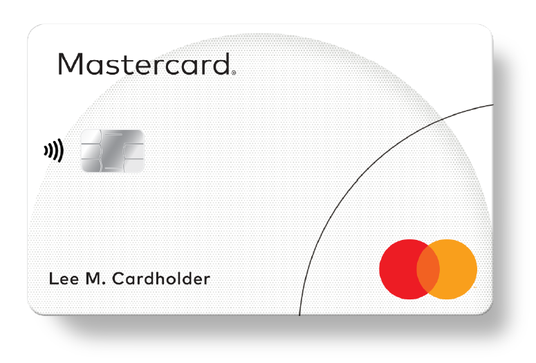
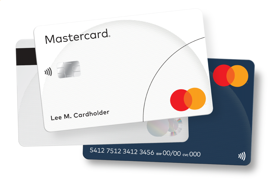
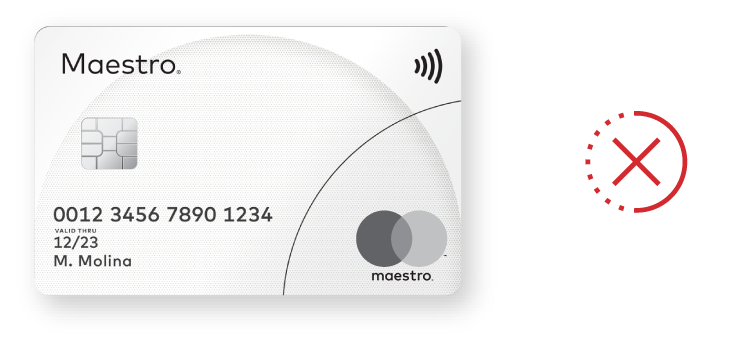
Illustrative examples of non-compliant card images follows.


At entry into a merchant location
Display the Mastercard® decal sticker on a main entry door or on a nearby window to signal acceptance. If these locations are not available, the decal sticker must be displayed so it is seen easily from the outside. Illustrative, but not exhaustive, examples of compliant and non-compliant displays follow.
Note: For merchant decal stickers, the primary source to receive decals is the financial institution that processes the merchant’s transactions. However, for convenience, merchants may download artwork to create custom signage or order limited quantities from Mastercard.


Note: Non-compliant example becomes compliant when Mastercard branding is added to the display in compliance with Using with other payment options and access marks* (e.g., (1) with acceptance marks, adding Mastercard branding at parity with size, frequency, color treatment, location, and prominence equal to that of all other acceptance marks and (2) with access marks, adding Mastercard branding with similar prominence to any access mark displayed (characteristics to consider for similar prominence, include size, frequency, color treatment, and co-location within the same field of vision)).
Note: Gray boxes in the examples of displays represent a payment option or access mark, as applicable. As used on brand.mastercard.com, an access mark is any name, logo, sound, haptic, visual depiction, trade name, logotype, trademark, service mark, trade designation, and/or other designation, symbol or mark not licensed by Mastercard, that identifies a service through which a Mastercard, Maestro, or Cirrus account can be accessed and/or accepted for a Mastercard, Maestro, or Cirrus transaction.
At the point of interaction
Also display Mastercard branding at the point of interaction (POI) to encourage card use. Examples of POI branding include: cash register, terminal display, digital display, tent cards, card presenters, etc.
- Physical decal stickers may be used on cash registers and terminals.
- For digital cash register or terminal displays, optimized artwork is available for download.
- The Mastercard Checkout Sound and Animation may be played and/or displayed at the POI. Please contact your Mastercard representative or contact us for more information.
Illustrative, but not exhaustive, examples of compliant and non-compliant displays follow.
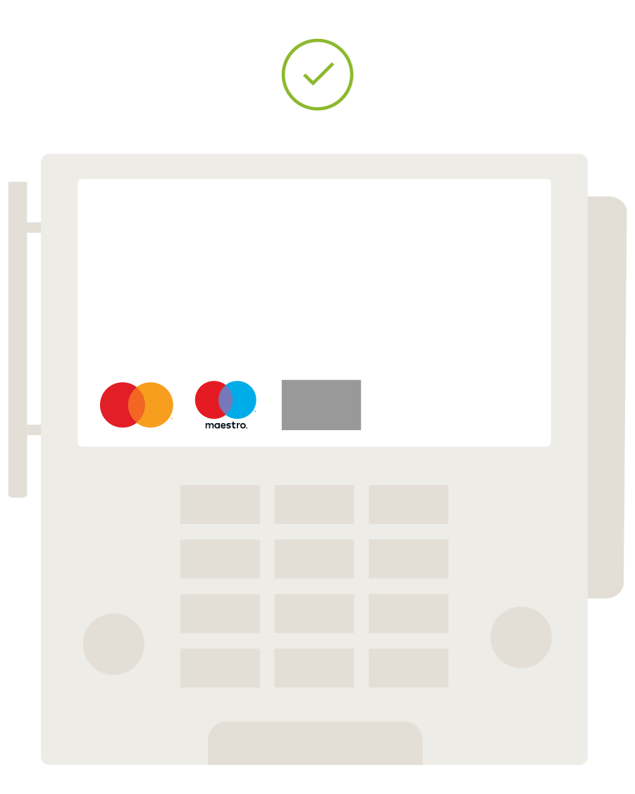

Note: Non-compliant example becomes compliant when Mastercard branding is added to the display in compliance with Using with other payment options and access marks* (e.g., (1) with acceptance marks, adding Mastercard branding at parity with size, frequency, color treatment, location, and prominence equal to that of all other acceptance marks and (2) with access marks, adding Mastercard branding with similar prominence to any access mark displayed (characteristics to consider for similar prominence, include size, frequency, color treatment, and co-location within the same field of vision)).
Note: Gray boxes in the examples of displays represent a payment option or access mark, as applicable. As used on brand.mastercard.com, an access mark is any name, logo, sound, haptic, visual depiction, trade name, logotype, trademark, service mark, trade designation, and/or other designation, symbol or mark not licensed by Mastercard, that identifies a service through which a Mastercard, Maestro, or Cirrus account can be accessed and/or accepted for a Mastercard, Maestro, or Cirrus transaction.
*With the exception of Mastercard in the U.S. Region and U.S. Territories, where a specific regional Standard that permits otherwise exists. Refer to Mastercard Rules, Rule 5.12.1 “Discrimination” of Chapter 16, “Additional U.S. Region and U.S. Territory Rules”.
Overview
This section applies to Mastercard® (and Maestro®) branding in all digital channels (e.g., in-app, browser, contactless*, voice-enabled devices, QR*, etc.) and must be applied when:
- Signaling acceptance of the Mastercard account credential.
- Representing card account/credentials visually or via voice-enabled digital payment interfaces.
*Mastercard Contactless Branding Requirements are available, see Use in contactless payments. The Mastercard QR brand requirements are available for download.
Display of Mastercard branding
Digital branding requirements for stored and tokenized credentials indicate how Mastercard branding should appear when credentials are displayed.
Stored credentials
A stored credential is a Mastercard account credential that a cardholder has approved a merchant, digital wallet operator, service provider, Click to Pay wallet, or other digital entity to store for use in a future transaction. The credential must be identified as a Mastercard account.
An entity that retains credentials must display on all payment user interfaces:
- The Mastercard Symbol or Mastercard card image (for tokenized credentials); and
- The last four digits of the account number.
Tokenized credentials
When a merchant, digital wallet operator, service provider, or other digital entity actively participates in the tokenization of a Mastercard credential in accordance with EMVCo standards, the Mastercard card image (instead of the Mastercard Symbol) must be shown in all payment user interfaces:
- A card image must be displayed on a neutral-colored background.
- The card image must include, at a minimum, the relevant Mastercard branding and the last four digits of the account number.
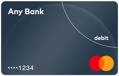
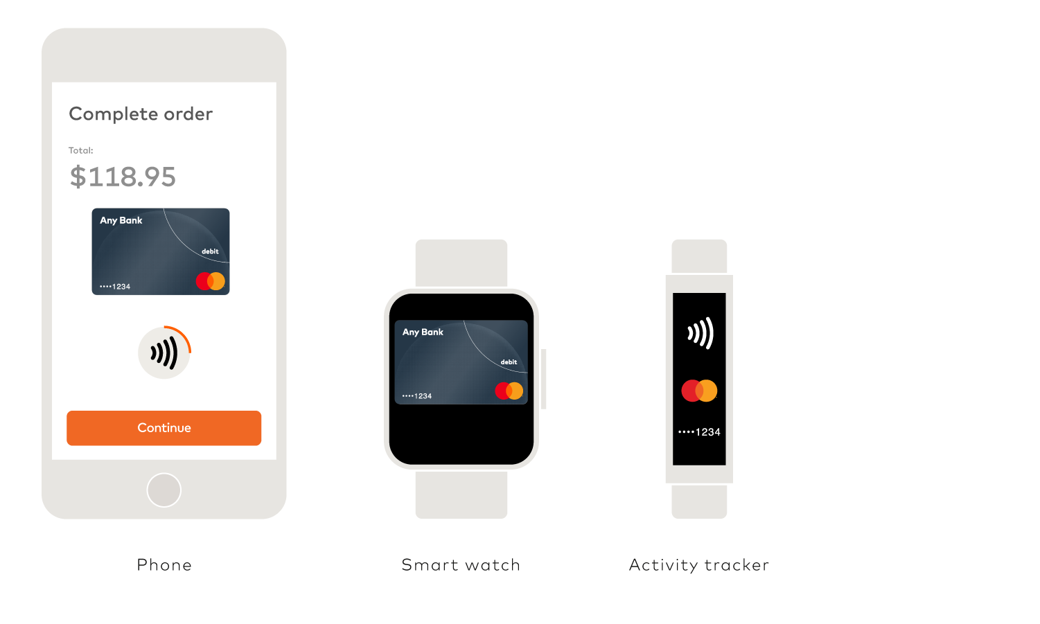
- On some very small form factors (e.g., digital activity tracker), use of the Mastercard card image might not be feasible. In these cases, the Mastercard Symbol and the last four digits of the account number may be used (Refer to image of activity tracker in the digital section of the Use in contactless payments).
Presentment of Mastercard credentials
To ensure the consumer is aware of the Mastercard credential being used in a transaction, the following principles must be followed:
Prior to purchase
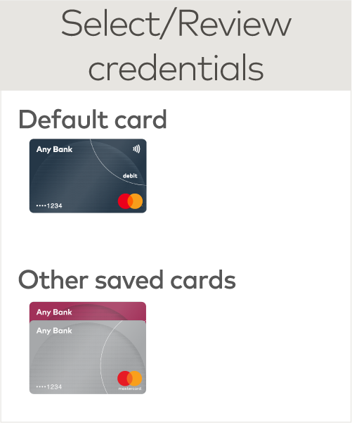
Prior to payment execution, the consumer, when initiating a purchase, must be presented with the stored credentials being used either visually or through another relevant mechanism (e.g., voice-enabled device). For payment experiences where consumers make a purchase using a visual display, Mastercard branding must appear when the consumer is:
- Loading card account/credentials on file.
- Selecting card account/credentials for payment (if applicable).
- Reviewing card account/credential details.
Post-purchase†
When a post-purchase confirmation (e.g., push notification, email, voice confirmation, Mastercard approved sound, etc.) is provided upon completion of the transaction, whether the purchase was initiated by the consumer or merchant, the consumer must receive confirmation of the Mastercard credential used.
†Refer to Mastercard Transaction Processing Rules 3.13 and 4.7 for e-commerce and contactless transaction receipt requirements.
Use of the Mastercard Checkout Sound and Animation
The Checkout Sound and Animation may be played or displayed as a form of confirmation in a digital environment. Please contact your Mastercard representative or contact us for more information.
Displaying the Mastercard Symbol
- A full-color Mastercard Symbol must appear with the last four digits of the account number in close proximity to the Symbol. The Mastercard Premium Brand Mark is not permitted.


- If the digital device is not color-capable, use the grayscale or solid Brand Mark.


- For devices that support text-only, the “Mastercard” name in text is acceptable.

- Ensure sufficient contrast between the screen background and the Symbol.
- To ensure the greatest legibility of the Mastercard Symbol, follow the recommended minimum size specifications (size may depend on screen/print resolution).

Displaying a Mastercard card image
Refer to the Card Design Standards manual published on mastercardconnect.com, for all of the card design requirements for tokenized and non-tokenized digital card images.
The Mastercard card image is required to be displayed in the user interface when the Mastercard credential is tokenized. The card image should provide a rich visual experience by representing the digitized card to the cardholder.
- A card image must be displayed on a neutral-colored background.
- A card image should be an exact replica of the corresponding physical card. The issuer may choose a generic representation of a Mastercard card, not matching the exact design or background color of the physical card. Token requestors obtain the card image during the tokenization process.
- Within digital interfaces, to indicate a card is deactivated, blocked, or not available for payment at this time, a card image may be “grayed back.” This means the entire card image—including Mastercard branding—must adhere to these requirements:
- The entire card must be grayed back equally (not only the branding).
- A grayed back card image is only permissible if all cards or payment methods in the interface are treated in the same visual manner. Mastercard cards must be depicted at parity (in terms of size, frequency, color treatment, and location) with all cards depicted in the interface. Refer to Using with other payment options and access marks.
- The level of tinting is flexible, provided the card branding remains recognizable.
Tokenized digital card images (including digital first images)
The following applies to the display of tokenized digital card images:
- The last four digits of the account number (PAN) must be in close proximity to the Mastercard Symbol on the visible side or in close proximity to the digital card image within the digital payment environment when a card is represented visually in any digital payment environment. All other PAN digits must be obscured or removed.


The following elements are prohibited:
- Chip
- Magnetic stripe
- Hologram
- Cardholder name
- Expiration date(s)
- CVC 2
- Signature panel
- Card Source Information
Relevant Mastercard branding must be included on the visible side, irrespective of where the branding is located on the physical card. Branding must be positioned and sized proportionately to match or exceed physical card design standards. The Mastercard Premium Brand Mark, if applicable, may only be used when the Mastercard Premium Brand Mark is present on the physical version of the card. Refer to the Card Design Standards manual for permissible branding placement locations.
SIZE RATIO OF THE SYMBOL RELATIVE TO THE CARD WIDTH
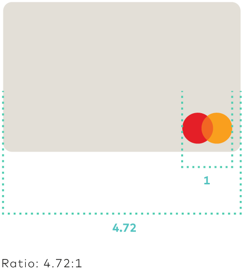
- Mastercard program identifiers, if applicable, must be proportionately sized to match or exceed physical card design standards.
- Debit and prepaid cards must display the “debit” Identifier (if required in the respective region).
- Inclusion of the contactless Indicator, if applicable, is optional. It may be included on the card image or in close proximity to the card image or Mastercard branding, sized to match or exceed physical card design standards. For more details see Use in contactless payments.
- A virtual account is a Mastercard account issued without a physical card or access device. A virtual account cannot be electronically read. For the avoidance of doubt, an account PAN tokenized for use on a mobile payment device is not considered a virtual account. Unlike the tokenized card image, on a virtual account card image, the 16-digit PAN, CVC 2 value, and expiration date are required; the chip must be removed.
- A Digital First card image follows the same requirements as a tokenized card image.
Non-tokenized digital card images
The following applies to the display of non-tokenized digital card images:
- The 16-digit PAN, CVC 2, and expiration date(s) are required on the visible side or in close proximity to the digital card image within the digital payment environment.
- Debit and prepaid cards must display the “debit” Identifier (if required in the respective region).
- The cardholder name, issuer name/logo, and customer service contact information may be included or in close proximity to the digital card image within the digital payment environment.
The following elements are prohibited:
- Chip
- Magnetic stripe
- Hologram
- Signature panel
- Card Source Information
Relevant Mastercard branding must be included on the visible side, irrespective of where the branding is located on the physical card. Branding must be positioned and sized proportionately to match or exceed physical card design standards. The Mastercard Premium Brand Mark, if applicable, may only be used when the Mastercard Premium Brand Mark is present on the physical version of the card. Refer to the Card Design Standards manual for permissible branding placement locations.
Minimum size for tokenized and non-tokenized digital card Images
- Exact replica: Must be no smaller than a final display width of 54 pixels (108 points)/15mm (0.59”)
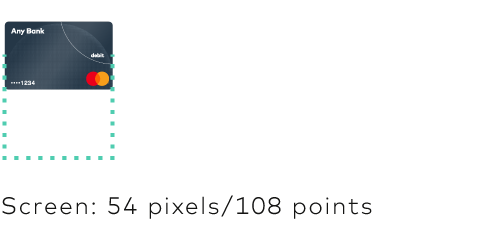
- Generic: Must be no smaller than a final display width of 36 pixels (72 points)/10mm (0.39”)

Note: Since November 2018, the full-color Mastercard Symbol without the word “mastercard®” is featured on cards. The Mastercard Symbol branding is required on all physical cards manufactured on or after 1 July 2020. Issuers may update their digital card imagery at any time to feature the Symbol. However, issuers must update these images simultaneously with the update of the physical companion card.
Use with other marks
The Mastercard Symbol, Mastercard card image, or Mastercard text must be presented at least at parity with all other payment marks, card images, or text depicted in a digital environment. For example, the Mastercard Symbol must be at least as prominent as, and appear in at least the same size, level of color reproduction, and frequency as all other payment marks appearing in that digital environment.
In the Europe Region, if the Mastercard (or Maestro) account number is co-badged with another payment scheme, the Mastercard/Maestro branding or card image should preferably be displayed separately from the mark or card image of the other payment scheme.
- When the brands are placed next to an account number not on a card depiction, the Mastercard/Maestro branding must appear first.
- Alternatively, a single card image showing both brands may be displayed in the wallet, with a mechanism to allow the cardholder to select the default brand, for example a toggle switch.
- Appropriate information must be provided to help the cardholder select the default brand.
- The Mastercard Symbol and account information must be displayed no less prominently than those of the co-badged payment scheme.
Signaling digital payment acceptance*
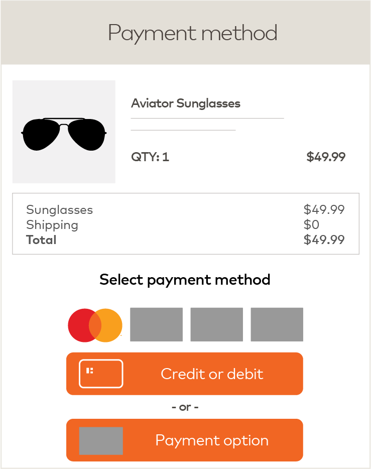
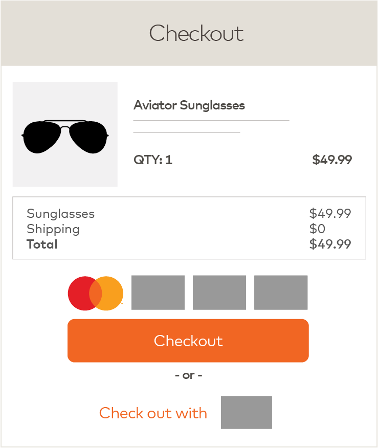
Mastercard/Maestro/Cirrus branding must be displayed in the digital environment whenever Mastercard is accepted and payment options and/or access marks are presented, including to signal payment acceptance and at credential load.
- Display Mastercard, Maestro, and/or Cirrus branding at parity (in terms of size, frequency, color treatment, and location) with all other acceptance marks, symbols, or logos displayed. If acceptance marks are presented in text only format, Mastercard, Maestro, or Cirrus branding must at least be at parity with other acceptance marks.
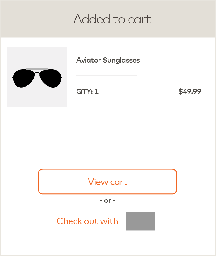
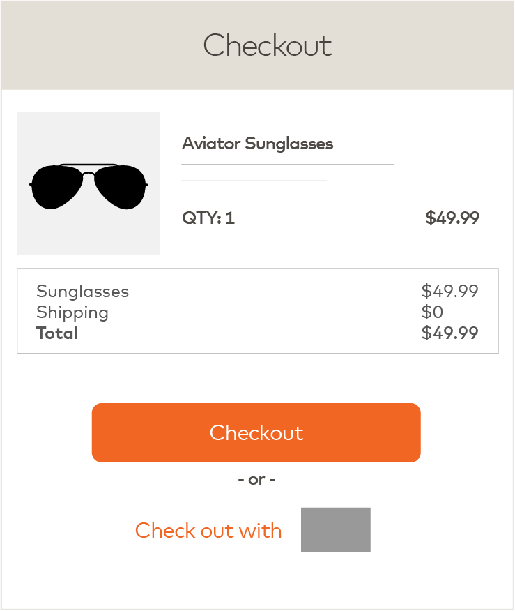
- Display Mastercard, Maestro, and/or Cirrus branding with similar prominence to any access mark displayed (characteristics to consider for similar prominence, include size, frequency, color treatment, and co-location within the same field of vision), except in the e-commerce environment as follows. In a digital environment, when displaying an access mark checkout option, Mastercard, Maestro, or Cirrus branding is not required to be displayed if (1) the cardholder can readily navigate from the screen displaying the access mark checkout option to a screen displaying a checkout option where Mastercard, Maestro, and/or Cirrus branding is appropriately displayed, or (2) Mastercard, Maestro, and/or Cirrus branding is appropriately displayed prior to payment confirmation, when use of an access mark checkout option is the only available checkout option.
- Use Mastercard-provided artwork.
- Use the reverse version of the Maestro or Cirrus Brand Marks on dark or busy backgrounds that do not provide sufficient contrast.
- The Mastercard Checkout Sound and Animation may be played and/or displayed to signal digital payment acceptance for Mastercard transactions. Please contact your Mastercard representative or contact us for more information.
SIGNALING DIGITAL PAYMENT ACCEPTANCE
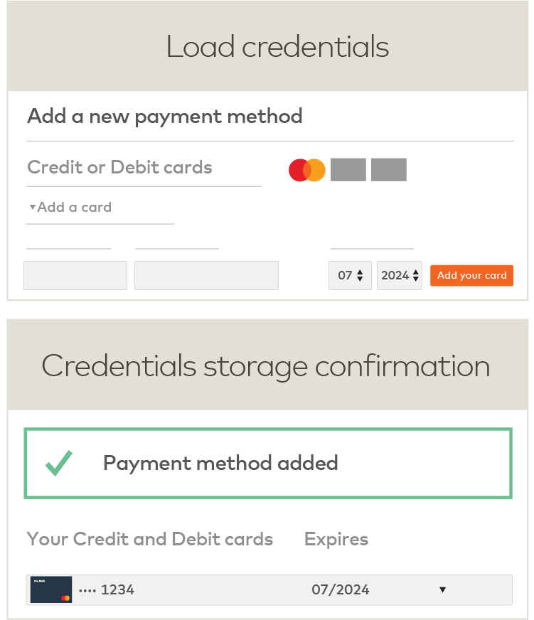
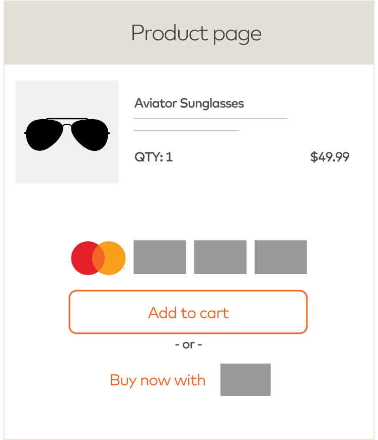
SIGNALING DIGITAL PAYMENT ACCEPTANCE

CHECKOUT EXPERIENCE
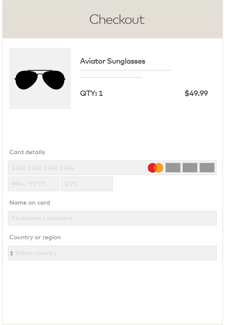
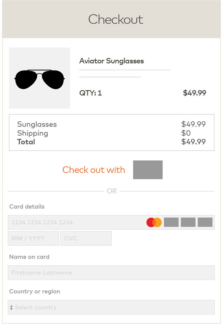
Note: Gray boxes in the examples of displays represent a payment option or access mark, as applicable. As used on brand.mastercard.com, an access mark is any name, logo, sound, haptic, visual depiction, trade name, logotype, trademark, service mark, trade designation, and/or other designation, symbol or mark not licensed by Mastercard, that identifies a service through which a Mastercard, Maestro, or Cirrus account can be accessed and/or accepted for a Mastercard, Maestro, or Cirrus transaction.
*With the exception of Mastercard in the U.S. Region and U.S. Territories, where a specific regional Standard that permits otherwise exists. Refer to Mastercard Rules, Rule 5.12.1 “Discrimination” of Chapter 16, “Additional U.S. Region and U.S. Territory Rules”.
Signaling acceptance in a voice environment
The Mastercard Checkout Sound may be played to signal acceptance for Mastercard transactions in a voice environment. Please contact your Mastercard representative or contact us for more information.Digital payment interfaces
Visual display interface
When a Mastercard stored credential is represented visually in any digital payment environment, including stored credentials displayed in a browser, in-app, or in a digital wallet, either the Mastercard Symbol or the Mastercard card image (for tokenized credentials) and the last four digits of the account number must appear in close proximity to the account representation in order to provide clear brand identification.
VISUAL DISPLAY FORM FACTORS
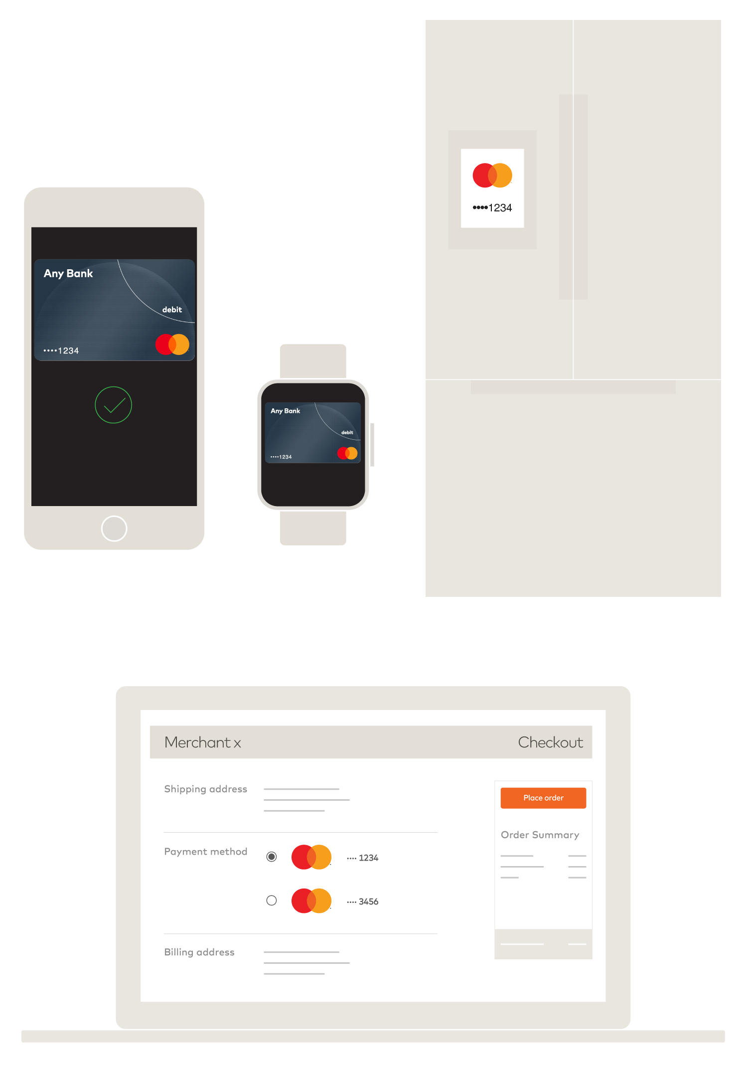
To ensure the consumer is aware of the Mastercard credential being used in a transaction, the following principles must be followed:
- Prior to payment execution, the consumer, when initiating a purchase, must be presented with the stored credentials being used. Mastercard branding must appear when the consumer is:
- Selecting card account/credentials for payment (if applicable).
- Reviewing card account/credential details.
- When a post-purchase confirmation (e.g., push notification, email) is provided upon completion of the transaction, the consumer must receive confirmation of the Mastercard credential used.
IN-BROWSER TOKENIZED

IN APP NON-TOKENIZED CHATBOT

Seamless payment experiences
Certain payment experiences are seamless as they allow payment with a Mastercard credential previously stored on file in few steps and without friction. To ensure the consumer has transparency in the seamless payment experience with regard to the Mastercard credential being used, the digital entity must conform to the stored and tokenized credentials requirements, as well as the following principles:
- Prior to payment execution, the consumer, when initiating a purchase, must be presented with the stored credentials being used, either visually or through another relevant mechanism* (e.g., voice-enabled device).
PRE-PURCHASE CONFIRMATION
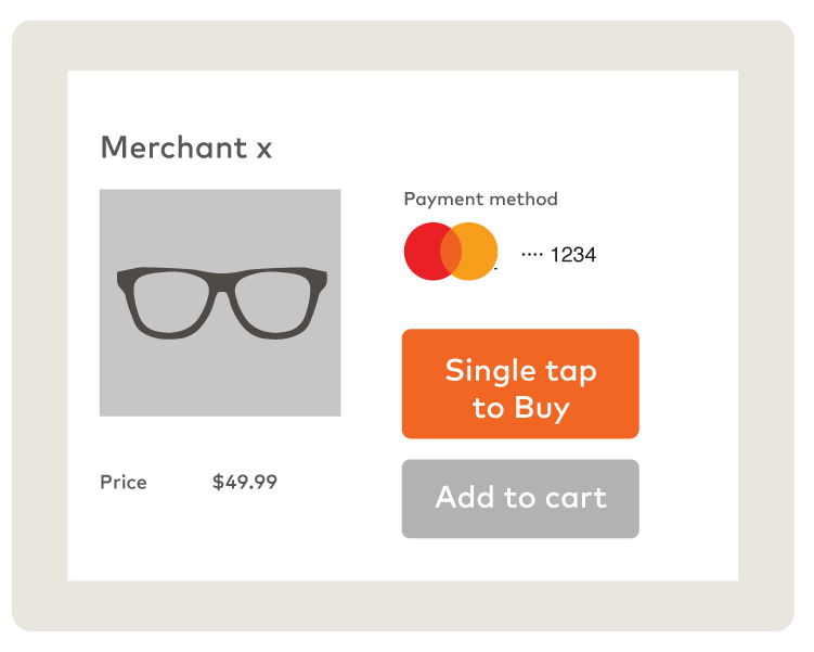

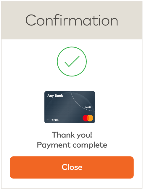
- When a post-purchase confirmation (e.g., push notification, email, voice confirmation, Mastercard approved sound, etc.) is provided upon completion of the transaction, whether the purchase was initiated by the consumer or merchant, the consumer must receive confirmation of the Mastercard credential used.
POST-PURCHASE CONFIRMATION

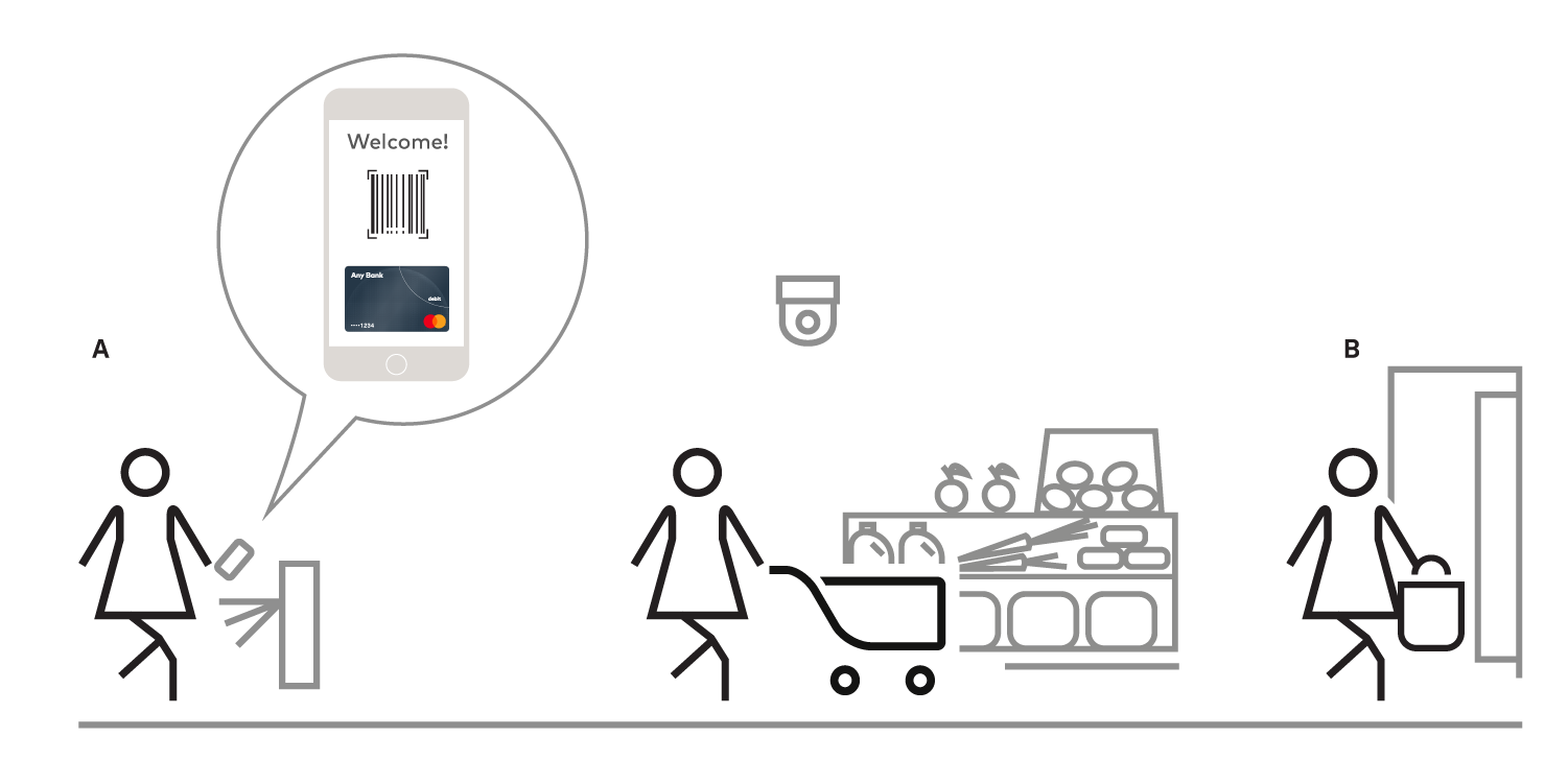
Seamless payment experiences use credentials previously stored on file and include, but are not limited to:
- Voice-enabled: When a voice-enabled device is used to make a purchase.
- Single tap: Where the consumer makes a payment in a single or limited number of steps.
- Checkout free: When the consumer initiates a purchase (Figure A), but does not take further action to complete the payment (Figure B).
- Recurring payment: When a merchant initiates a transaction, for a variable or fixed amount, using a credential that the consumer has previously stored on file with and authorized for future use by such merchant periodically and on an ongoing basis with no specified end date.
*The entity presenting the Mastercard credential may offer the consumer the choice to opt out of receiving a voice-enabled pre-purchase credential confirmation. The default should initially be set as opt-in.
Signaling Mastercard Click to Pay enablement
Overview
This section includes requirements for representation of EMV® Secure Remote Commerce (“SRC”) payment mark otherwise known as the “Click to Pay icon” and technology as “Click to Pay”, in conjunction with the core Mastercard® and/or Maestro® marks.
SRC is a global specification developed by EMVCo to create an e-commerce payment experience that aims to deliver the same security, convenience, and control currently offered to cardholders paying in the physical world.
Click to Pay is the consumer facing reference to the SRC technology, service, and icon. This section includes requirements for the use of Click to Pay in all aspects of the consumer journey, from mobile to marketing. All requirements apply to all marketing and digital interfaces, unless otherwise specified.
Glossary of Click to Pay-related terminology
CLICK TO PAY TERMINOLOGY
SRC Participant
An entity that is configured to participate in an SRC ecosystem. This may include issuers, merchants, entities playing the role of SRC initiators, digital card facilitators, digital payment applications, and payment service providers.
Click to Pay icon or “icon”
An icon that is a trademark of EMVCo, LLC that is used to signal that a remote-commerce channel offers payments enabled by the EMV Secure Remote Commerce specification.
SRC System
A technical platform that facilitates remote card payments.
SRC System operating image
The unique image(s) referring to SRC System operating network card(s) accepted by the merchant that will be displayed in association with the Click to Pay icon.
TRIGGER AND ASSET TERMINOLOGY
Horizontal mark
The file name for the asset that consist of the Click to Pay icon, Vertical separator line, and SRC Participant mark or all SRC System operating image(s) that a merchant accepts.
Trigger format
Any format that initiates and provides the starting point for a Click to Pay experience and is placed on the digital payment application.
Vertical separator line
The line that separates the Click to Pay icon from an SRC Participant mark or SRC System operating image(s).
Vertical mark
The file name for the Click to Pay icon digital asset.
Click to Pay icon and assets
The Click to Pay icon, also referred to herein as “icon” or “Vertical mark”, is an EMVCo trademark and is used to signal that a remote-commerce channel offers payments enabled by the EMV Secure Remote Commerce Specification.
The icon is comprised of a pentagon design oriented on its side with a stylized depiction of a fast forward symbol on the right, formed by a continuous line.
CLICK TO PAY ICON OR VERTICAL MARK
When to use the icon
Use the icon as a standalone visual representation of Click to Pay functionality on all digital payment interfaces such as websites and in-app interfaces. Click to Pay participants can use in marketing collateral or non-Trigger Format use cases (payment labels and titles).
How to use the icon
The icon must always appear exactly as shown in these standards and must never be broken apart, stretched, skewed, or visually altered in any way.
Clear space
Always surround the icon with sufficient clear space, which as a general requirement must be equal to one quarter (.25x) of the full height of the icon (x).
In certain use cases (e.g., mobile), where space may be extremely limited, the clear space requirement does not apply in full. When the height of the icon is less than or equal to 32px, 2mm/8px clear space is required on all surrounding sides of the icon. When the height of the icon is greater than 32px, one quarter (.25x) of clear space is required around the icon.
Minimum size
In most use cases, the icon must appear at a height no smaller than 5mm/20px.
Where space may be extremely limited, the icon must appear at a height no smaller than 3mm/12px. A 10px minimum size is supported for extreme cases.
Icon color for marketing use
In marketing, the icon may be black or white, alternatively, the icon may appear as a solid, monochromatic color, provided the color provides sufficient contrast and legibility against the selected background.

Marketing materials examples include participant websites, sales collateral, consumer-facing materials, and promotional materials, for example: notebooks, t-shirts, giveaways.
Icon color for checkout/digital use
A black icon must appear against a white or light-colored background. A white icon must appear against a medium or dark-colored background (for example, green as displayed below).

Checkout/digital icon use examples include e-commerce website and in-app interfaces, where Click to Pay is available.
WCAG 2.0 AA web accessibility standards include requirements for determining if there is sufficient contrast of background colors in a digital experience:
How to obtain Click to Pay icon artwork
The artwork (.ai, svg, png, etc.) may be downloaded by clicking directly on the links below.
*Not yet available for checkout/digital.
Requirements to use the icon
A right to use the Click to Pay icon is granted to Mastercard licensed customers, Mastercard merchants, participants in Mastercard’s Click to Pay program, and registered service providers or other licensees under sublicense from EMVCo under Mastercard’s licenses with EMVCo. Such Mastercard licensed customers or other entities may use the EMVCo Marks subject to the terms and conditions set forth in this section and the EMVCo standards and specifications available from EMVCo, including from the Internet website of EMVCo (currently located at https://www.emvco.com, as such website address may change from time to time). Such use of the Click to Pay icon must comply with these requirements and the EMVCo standards and specifications. Such licensed Mastercard customers or other entities are not required to execute the EMVCo licensing agreement for use of the EMVCo Marks. The sublicense from Mastercard is sufficient, or a written Trademark License Agreement must be in place with EMVCo for the right to use the icon.
The sublicense from Mastercard is sufficient, or for those without a sublicense from Mastercard, a written Trademark License Agreement must be in place with EMVCo for the right to use the icon.
Icon with SRC Participant mark or SRC System operating image(s)
The Click to Pay icon may be displayed on a stand-alone basis as described above or may be displayed in combination with an SRC Participant mark (mark) or SRC System operating image (image). These assets, referred to as the “Horizontal mark” can be used in marketing materials to signal Click to Pay participation and acceptance or can be used to trigger a Click to Pay transaction at the point of interaction.
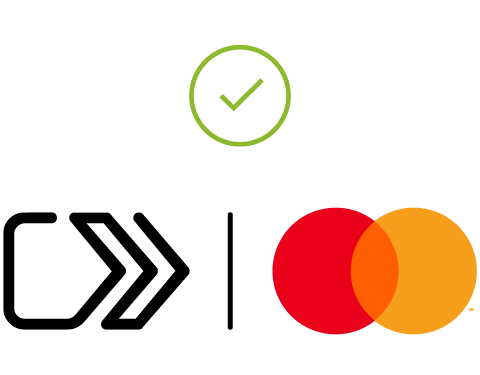
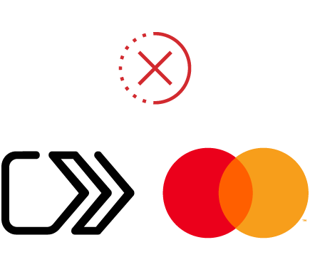
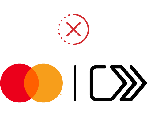
- Always include the icon, positioned first, followed by the Vertical separator line, and then include an SRC Participant mark/System operating image.
- The Horizontal mark must appear in full color, following respective brand requirements, and follow parity requirements of equal size, color, and frequency among the Click to Pay icon and participant marks.
- The order in which SRC System operating images appear after the icon is participants’ choice; however, the Mastercard/Maestro branding is preferred to be first after the Click to Pay icon if the participant has a business relationship with Mastercard.
- Follow consistent spacing between the icon, Vertical separator line, and mark(s)/image(s). Spacing is .35x where x = the height of the Click to Pay icon.
- When the SRC Participant mark(s)/image(s) is/are displayed at checkout, the Click to Pay icon and the Mastercard branding must be displayed at parity (in terms of size, frequency, color treatment, and location) with all other acceptance marks presented.


Determining size parity between the Click to Pay icon and SRC marks/images
A mark/image may exceed a dimension of the Click to Pay icon by 20% within these parameters:
[incremental height %] + [incremental width %] ≤ 20%, where:
- [incremental height %] is the percentage by which the height of the SRC System operating image or SRC Participant mark exceeds the height of the Click to Pay icon; and
- [incremental width %] is the percentage by which the width of the SRC System operating image or SRC Participant mark exceeds the width of the Click to Pay icon
The SRC System operating image(s) or SRC Participant mark(s) must meet or exceed the dimension of Click to Pay icon by equal incremental percentage defined by the sum of incremental height % + incremental width %.
COMPLIANT DISPLAY OF SRC SYSTEM OPERATING IMAGES SIZED ACCORDING TO THE PARITY MODEL ABOVE


COMPLIANT DISPLAY OF A HORIZONTAL MARK IN A MOBILE HEADER

COMPLIANT DISPLAY OF A CLICK TO PAY ICON WITH PARTICIPANT MARK (E.G., ISSUER, ACCEPTING MERCHANT) AND SYSTEM OPERATING IMAGES
FOR MARKETING USE TO SIGNAL CLICK TO PAY ACCEPTANCE ON A TERMINAL, OR COUNTER CARD, FOR EXAMPLE.
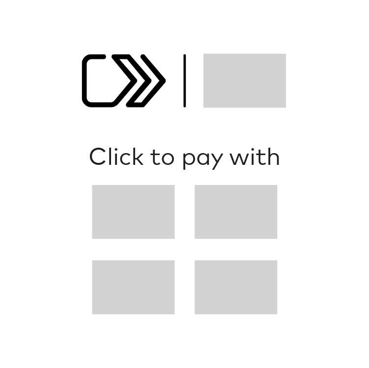
Note: Gray boxes in the example represent payment option.
How to obtain the Horizontal mark assets artwork
Click to Pay in checkout/digital environments
A Click to Pay-enabled transaction may be represented as a payment option in digital point of interaction environments, including, merchant’s desktop and mobile website and in-app interfaces, as a Trigger Format and/or as a non-Trigger Format.
- A “Trigger Format” initiates a Click to Pay experience.
- A “non-Trigger Format” does not initiate a Click to Pay experience and can include Click to Pay branding to describe the payment option or payment technology available to the cardholder.
To determine if the payment method selection is a Trigger Format or a non-Trigger Format, ask the following question:
Trigger requirements
The style of Trigger Format used to initiate a Click to Pay-enabled transaction depends on the merchant’s capabilities:
- When the merchant environment supports graphics
- When the merchant environment does not support graphics
When the merchant environment supports graphics
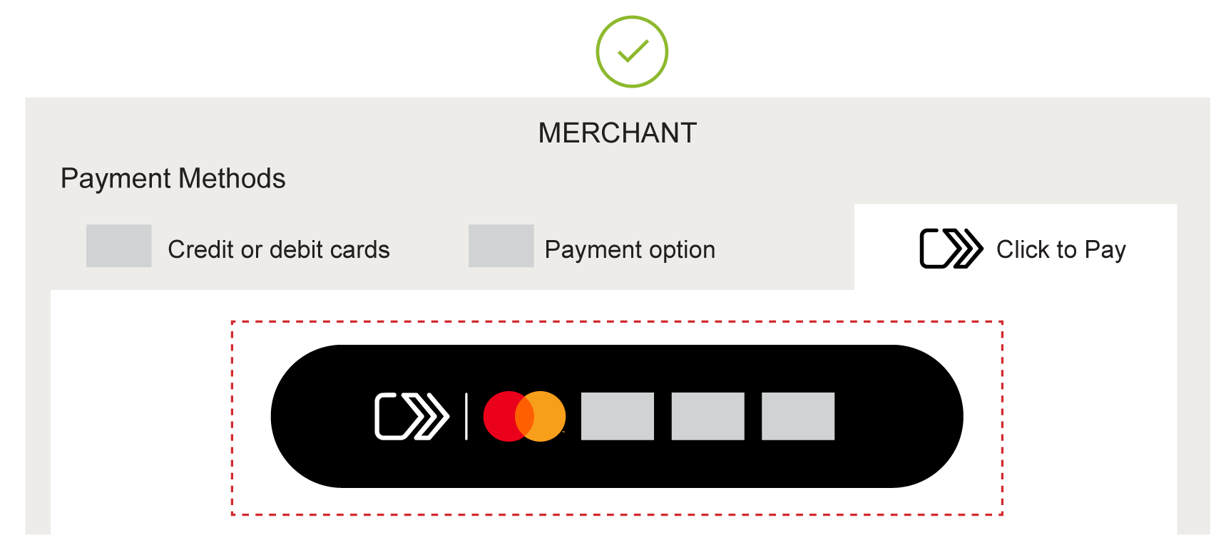
The Trigger Format must include the Click to Pay icon, Vertical separator line, Mastercard/Maestro branding, and any other accepted SRC System operating images.
When the merchant environment does not support graphics
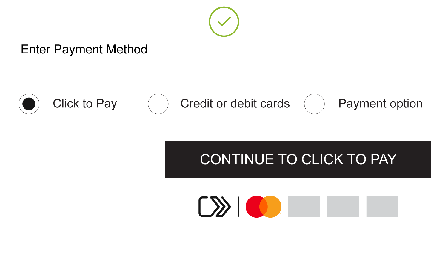
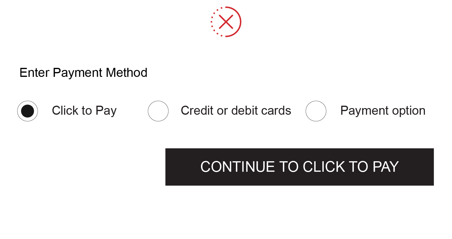
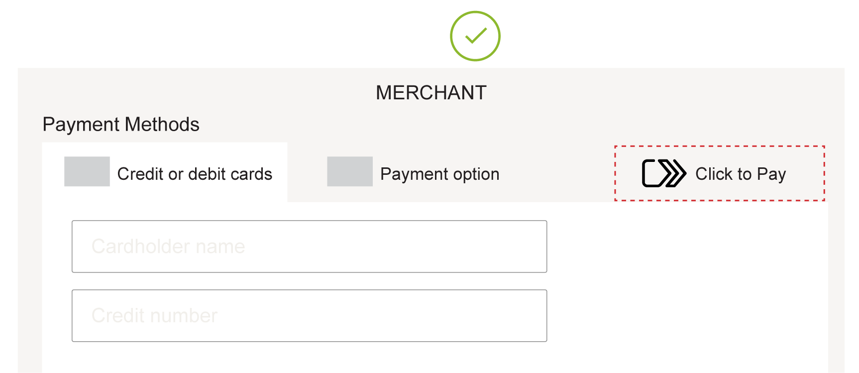
- In a non-graphics enabled environment, use “Click to Pay” to represent that a Click to Pay-enabled experience is available.
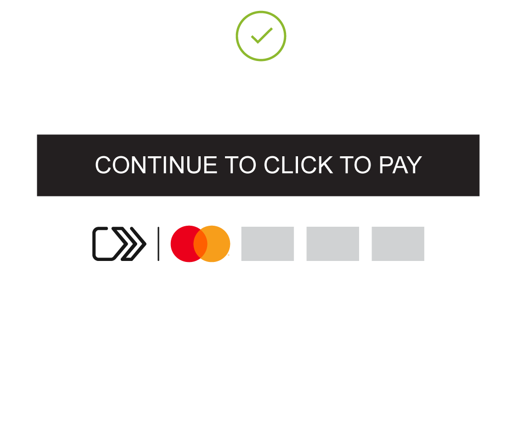
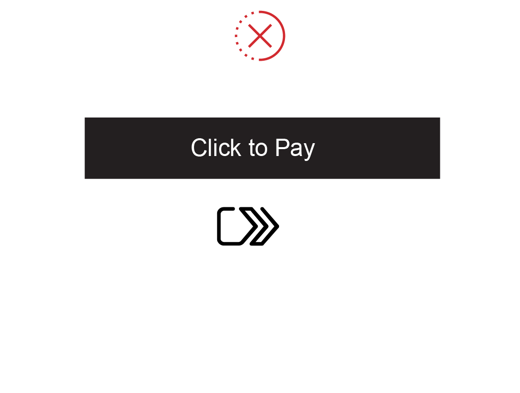
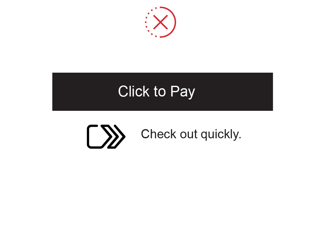
- The Horizontal mark asset must be placed in immediate proximity to the payment selection format when graphics are not supported inside the trigger area. Immediate proximity means placement near a non-graphics supported payment selection format or textual confirmation of payment selected by the user, with a minimum distance of 8 pixels of white space between the graphical content of the trigger and the payment selection.
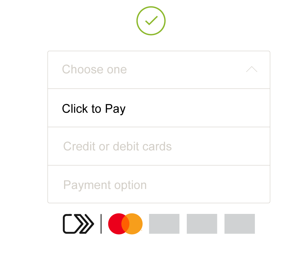
ILLUSTRATIVE, BUT NOT EXHAUSTIVE, EXAMPLES OF COMPLIANT AND NON-COMPLIANT DISPLAY OF THE CLICK TO PAY ASSETS WHEN THE MERCHANT ENVIRONMENT DOES NOT SUPPORT GRAPHIC-ENABLED TRIGGERS
Integrated merchant Trigger Format
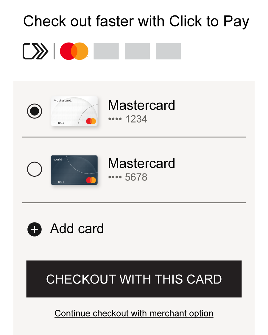
An integrated merchant Trigger Format is a Click to Pay experience that is triggered off the merchant’s existing checkout trigger.
When Click to Pay is triggered off the merchant’s existing checkout trigger, the icon with SRC System operating images must be displayed in immediate proximity of the merchant’s checkout button with merchant’s own call to action descriptive language. Immediate proximity means placement near a non-graphics supported payment selection format or textual confirmation of payment selected by the user, with a minimum distance of 8 pixels of white space between the graphical content of the Trigger Format and the payment selection.
For example, if the merchant’s checkout button label says “CHECKOUT” and the button initiates a Click to Pay-enabled transaction, the Horizontal mark asset must be displayed in immediate proximity of this trigger.
Another example of an integrated merchant Trigger Format is when the card list is presented within the merchant UI that then invokes the Click to Pay checkout experience.
Non-Trigger Format requirements
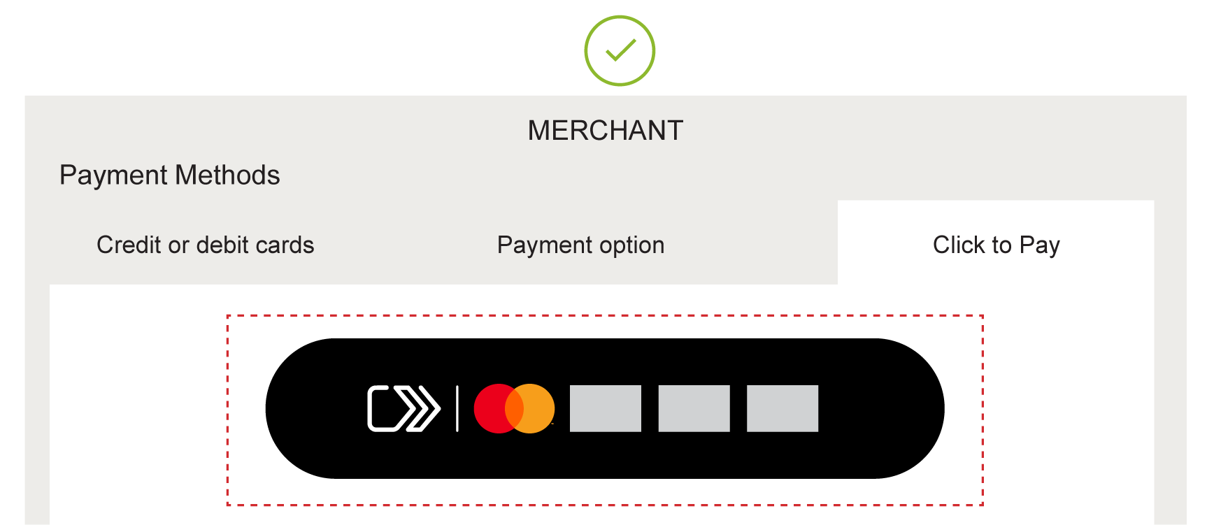
A non-Trigger Format does not initiate a Click to Pay experience; however, Click to Pay branding may be used to display and represent that Click to Pay-enabled technology is available on the merchant or payment service provider’s website and in-app interfaces. Presentation of a non-Trigger Format also depends on the graphics capabilities of a merchant’s website and in-app interface. Any combination of the Click to Pay name, icon/Vertical mark, and Horizontal mark asset may be used in non-Trigger Formats within user interfaces.
ILLUSTRATIVE, BUT NOT EXHAUSTIVE, EXAMPLES OF COMPLIANT DISPLAY OF THE CLICK TO PAY ASSETS IN A NON-TRIGGER FORMAT
Click to Pay integration
How to use “Click to Pay”
When describing the features of Mastercard’s Click to Pay program in marketing and product communications, use “Mastercard Click to Pay.”
- “Mastercard Click to Pay” must be applied in the first or most prominent instance on a page/screen. (Only required when describing features specific to the Mastercard Click to Pay implementation.)
- In subsequent use “Click to Pay” is sufficient.
- Do not use “Click to Pay,” or “Mastercard Click to Pay” more than once in a sentence.
Use “Click to Pay” in the product without the “Mastercard” modifier, especially on network-neutral communications or in user interfaces such as the SRC Initiator.
Click to Pay may be applied without “Mastercard” as a modifier when network neutral or describing product usage.
- It is important to distinguish that the user is only deleting/accessing their Mastercard information in Click to Pay for data and security reasons.
“Click to Pay” may be used as a reference to the technology, service, and icon, or actively as follows:
|
|
|
| Descriptive reference | Action |
|
“Create a Click to Pay profile with your Mastercard®.” “Use your Mastercard when you see the Click to Pay icon.” "Use your Mastercard in Click to Pay” “Check out wherever you see the Click to Pay icon” “Enroll your Mastercard in Click to Pay for a convenient and secure checkout.” |
“Simply click to pay quickly and securely.” “Click to pay quickly and securely.” |
|
Uppercase “C” and “P” Uppercase is permitted if the surrounding text also is uppercase. |
Sentence case |
- “Mastercard” with “Click to Pay” must not be used as an action.
- The word “Click to Pay” and icon may be used together in marketing with or without the Vertical separator line.
- When used to describe an action, local language equivalent is permitted.
- “Secure Remote Commerce” or “SRC” must not be consumer facing.
ILLUSTRATIVE, BUT NOT EXHAUSTIVE NON-COMPLIANT EXAMPLES OF “CLICK TO PAY”
ClicktoPay
Click-to-Pay
Click 2 Pay
CTP
Trademark attribution language
In communications, the following trademark attribution language must be included where space permits: “The Click to Pay icon is a trademark owned by and used with permission of EMVCo, LLC.” Where images are not supported, the following attribution language should be used: “The Click to Pay icon, consisting of a pentagon design oriented on its side with a stylized depiction of a fast forward symbol on the right, formed by a continuous line, is a trademark owned by and used with permission of EMVCo, LLC.” Where space is limited, the following attribution language may be used: “The Click to Pay icon is a trademark owned by and used with permission of EMVCo, LLC.”
The above language may be omitted when used at checkout/digital.
Overview
This section includes requirements for representation of contactless capability through the use of the EMVCo, LLC (“EMVCo”) Contactless Indicator and Contactless Symbol, which are EMVCo marks, in conjunction with the core Mastercard® and/or Maestro® marks. Cirrus® can also be contactless to support contactless ATM usage.
This section includes requirements for the use of the Contactless Indicator on physical and digital cards, mobile phones, other payment and non-payment form factors, POS signage, and within supporting marketing and communications.
This section outlines the use of the Contactless Symbol on payment terminals. See the Mastercard Card Design Standards on mastercardconnect.com for requirements for display on cards and devices.
A right to use the Contactless Indicator and the Contactless Symbol and other EMVCo marks (“EMVCo Marks”) is granted to Mastercard customer or other licensee under sublicense from EMVCo under Mastercard’s licenses with EMVCo. Mastercard issuers and acquirers may use the EMVCo Marks subject to the terms and conditions set forth in this section and the EMVCo standards and specifications available from EMVCo, including from the Internet website of EMVCo (currently located at www.emvco.com, as such website address may change from time to time). Such use of the Contactless Indicator and the Contactless Symbol must comply with these requirements and the EMVCo standards and specifications.
Mastercard customers are not required to execute the EMVCo licensing agreement for use of the EMVCo Marks. The sublicense from Mastercard is sufficient.
A customer or other licensee must not register or attempt to register a Mastercard, Maestro, or Cirrus mark or an EMVCo mark.
Contactless branding on cards and devices
The EMV Contactless Indicator
The EMVCo Contactless Indictor denotes contactless capability and is present on all contactless cards and form factors which have payments as a primary use case, and may be displayed on the screen of contactless mobile devices.
If a Mastercard card or device is contactless-enabled, the card or device must include the Contactless Indicator; except for payment secondary devices, where the Contactless Indicator must be included where possible. Refer to the Mastercard Card Design Standards for requirements for display of the Contactless Indicator on cards and devices.
For details and requirements on use of the Contactless Indicator on cards and devices see the EMVCo standards and specifications available from EMVCo, including from the Internet website of EMVCo (currently located at www.emvco.com, as such website address may change from time to time). Such use of Contactless Indicator must comply with these requirements and the EMVCo standards and specifications.
Refer to Using with other payment options and access marks and Signaling digital payment acceptance in Use in digital payments for display and parity requirements on cards and devices.
EMV CONTACTLESS INDICATOR


SAMPLE PROXIMITY PLACEMENT ON AN NFC-ENABLED DEVICE
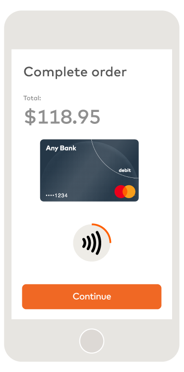
Contactless branding on non-digital contactless devices
Payments-primary devices requirements include:
- These include fobs, stickers, wristbands, SIM chips, and similar devices designed solely or principally for payments.
- The EMV® Contactless Indicator must be displayed along with Mastercard® branding
- The Contactless Indicator must be displayed (if a Contactless Indicator may be present) and may be placed anywhere on the device, provided the Contactless Indicator is clear and legible and meets the display requirements.
- Where full-color Mastercard/Maestro branding is not technically possible, or when all branding on a device is intentionally one color, one-color Mastercard/Maestro branding may be used.
Payments-secondary devices requirements include:
- These are multipurpose/function devices where the primary use case is not payment-related.
- Use cases could include traditional watches (e.g., non-digital), apparel, jewelry, car remotes, and similar devices.
- The Contactless Indicator must be displayed on payments-secondary devices where possible and may be placed anywhere on the device, provided the Contactless Indicator is clear and legible and meets the display requirements.
- Where full-color Mastercard/Maestro branding is not technically possible, or when all branding on a device is intentionally one color, one-color Mastercard/Maestro branding may be used.
Mastercard/Maestro branding in a contactless transaction
Refer to Use in digital payments for branding requirements on digital devices.
- While the Mastercard card image must be shown in digital environments when a Mastercard account credential is tokenized, such card image is not required on tokenized non-digital contactless devices.
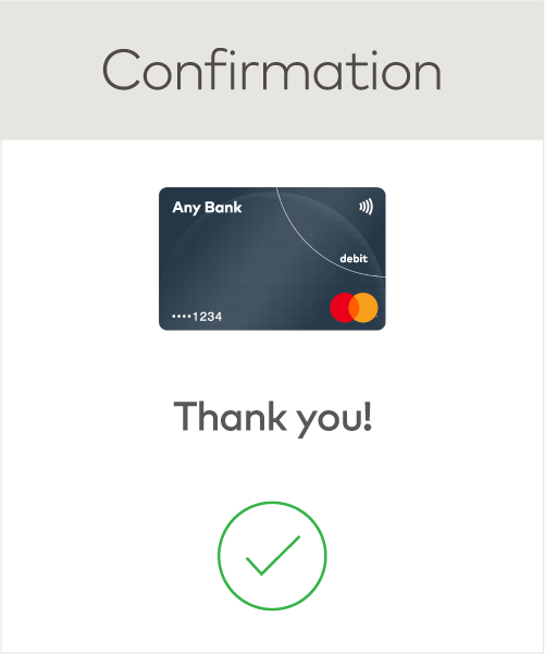
- Upon completion of a transaction, the digital provider must provide a confirmation of the payment credential used for the purchase via a real-time push notification, text message, or email on the companion digital device, if applicable.
EXAMPLE OF PURCHASE CONFIRMATION NOTIFICATION

EXAMPLES OF NON-DIGITAL CONTACTLESS DEVICES
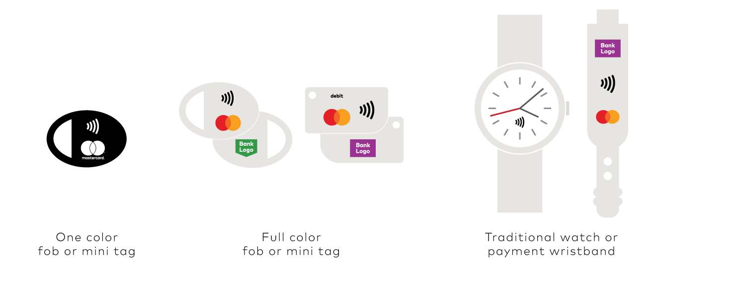
Note: The Mastercard “debit” identifier is required on Debit Mastercard non-digital contactless account devices issued in the “Debit Mastercard countries”.
Branding on digital contactless devices
When a Mastercard® or Maestro® account is represented in a contactless digital display, such as a digital wallet or other digital application, the digital branding requirements must be followed as outlined in the Digital payment interfaces tab in Use in digital payments.
Contactless devices that contain a payment screen display must present the Mastercard or Maestro card image, including Mastercard/Maestro branding and last four digits of the account number. On some very small form factors (e.g., digital activity tracker) where credentials are tokenized, if the use of the card image is not feasible, the Mastercard or Maestro Symbol and the last four digits of the account number may be used.
Refer to Mastercard Transaction Processing Rules 3.13 and 4.7 for e-commerce and contactless transaction receipt requirements.
EXAMPLES OF DIGITAL CONTACTLESS DEVICES
SAMPLE PAYMENT FLOW
Contactless branding on payment terminals and ATMs
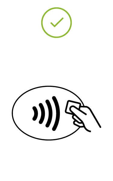
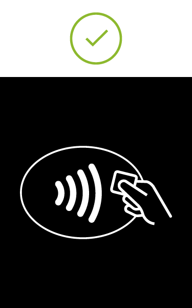
The EMV Contactless Symbol is intended only for use at the point-of-sale on EMV specification compliant terminals, and within associated marketing collateral directing consumers where to tap their contactless device.
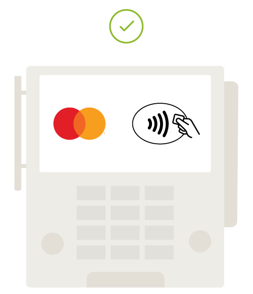
Point-of-sale (POS) terminals and ATMs that are contactless enabled must include the Contactless Symbol and, where other acceptance marks are displayed, Mastercard or Maestro branding, as applicable. The Contactless Symbol must be displayed on terminals and readers that are compliant with the EMVCo standards and specifications and may not appear on non-compliant terminals. Refer to Using with other payment options and access marks and Signaling digital payment acceptance in Use in digital payments for display and parity requirements at the POS.
For details and requirements on use of the Contactless Symbol on terminals and ATMs see the EMVCo standards and specifications available from EMVCo, including from the Internet website of EMVCo (currently located at www.emvco.com, as such website address may change from time to time). Such use of Contactless Symbol must comply with these requirements and the EMVCo standards and specifications.
EMV CONTACTLESS SYMBOL
EXAMPLE OF TERMINAL WITH MASTERCARD SYMBOL AND THE CONTACTLESS SYMBOL
Contactless branding on point-of-sale (POS) and point-of-interaction (POI) signage and marketing communications
Contactless POS and POI signage may be used to supplement the required display of decal stickers at Mastercard® and Maestro® merchant locations enabled for contactless payments. The following requirements apply for any Mastercard and Maestro contactless branding on signage and in marketing communications:
- The Contactless Indicator must appear with the Mastercard and Maestro branding on POS signage to indicate acceptance of contactless payments.
- Optional messaging set in FF Mark Medium or similar san serif font may accompany the Contactless Indicator. FF Mark Medium may be purchased from Fonts.com.
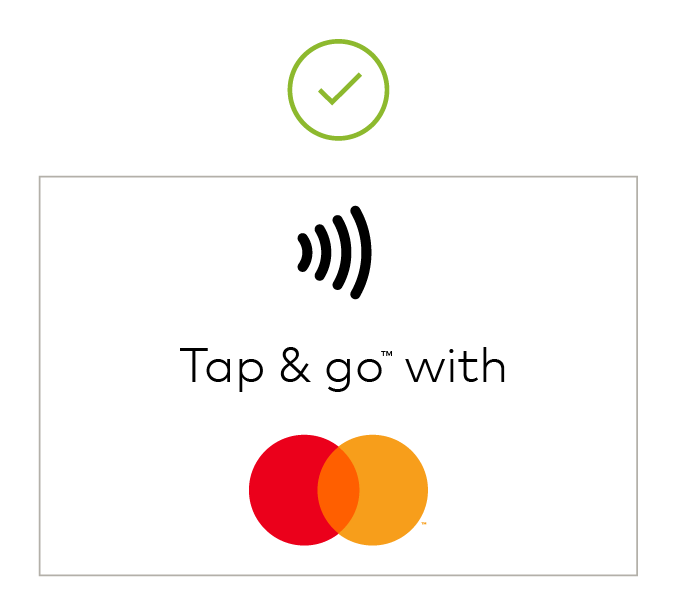
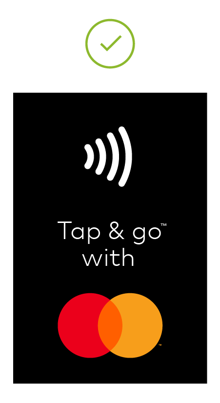
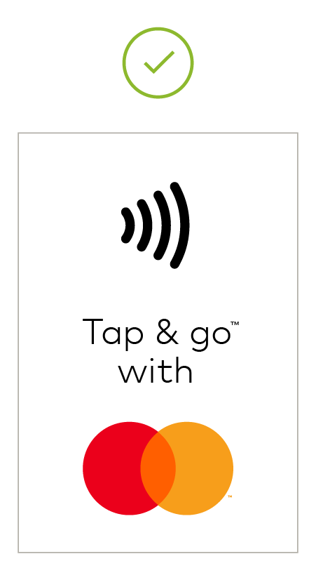
- Acceptable messaging is “Tap & go™”, “Accepted” or local language equivalent.
- “Tap & go™” may not be used with other payment brands.
- Refer to Using with other payment options and access marks and Signaling digital payment acceptance in Use in digital payments for display and parity requirements at the POS.
Note: The term “contactless” is not considered a consumer facing message and should be used minimally.
Mastercard-provided POS/POI signage/decals/stickers
- Mastercard has developed POS signage in several configurations.
- The artwork has been created in English, typeset in FF Mark Light.
- It is acceptable to adapt this artwork to include English and local language or local language only, provided the basic design format is maintained. Simply extend the height of the artwork to accommodate additional lines of text where applicable.
- Approved images include:
MERCHANT ENTRANCE WITH SUPPLEMENTAL CONTACTLESS POS SIGNAGE
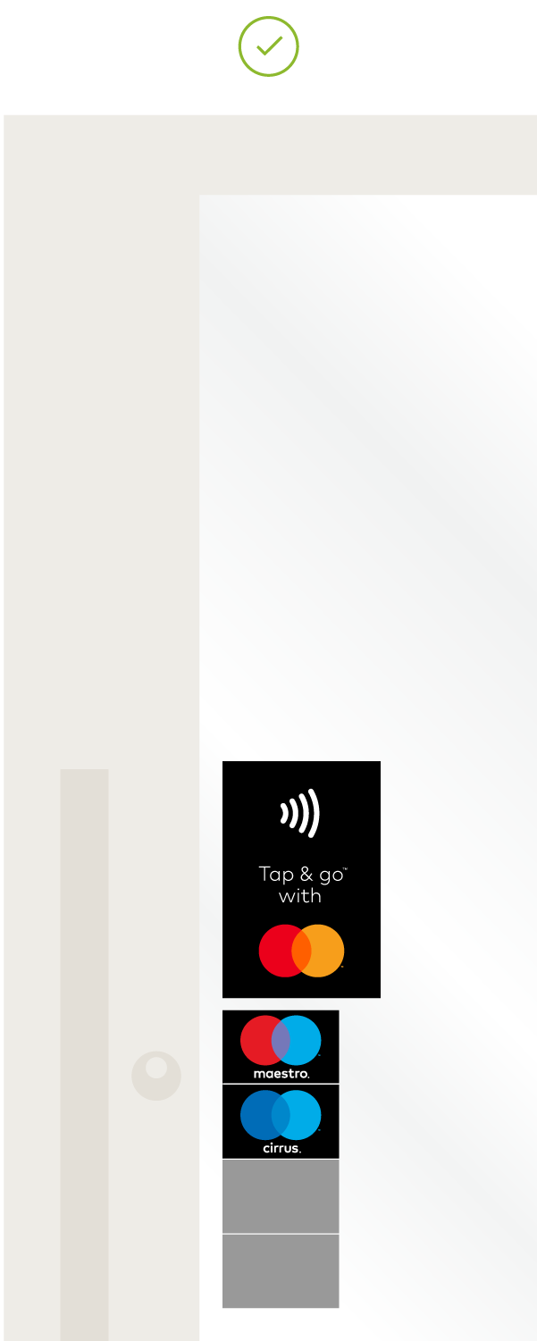
Note: Gray boxes in the example represent a payment option or access mark, as applicable. As used on brand.mastercard.com, an access mark is any name, logo, sound, haptic, visual depiction, trade name, logotype, trademark, service mark, trade designation, and/or other designation, symbol or mark not licensed by Mastercard, that identifies a service through which a Mastercard, Maestro, or Cirrus account can be accessed and/or accepted for a Mastercard, Maestro, or Cirrus transaction.
COMBINATION DECALS
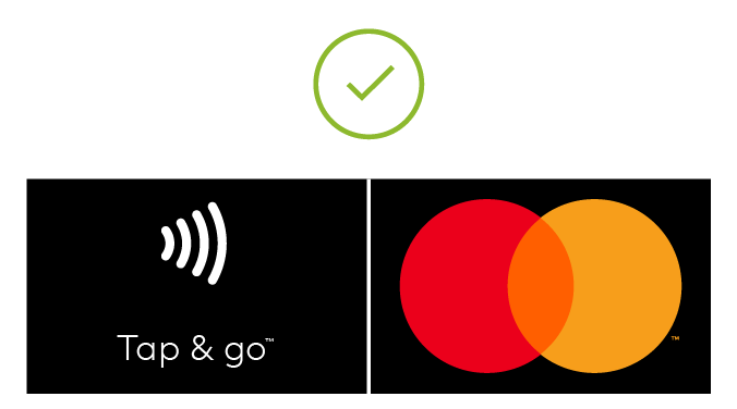
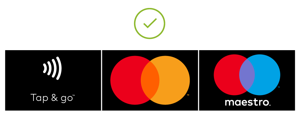
TAP & GO WITH MASTERCARD HORIZONTAL
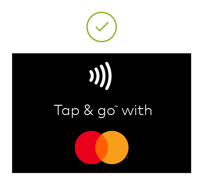
TAP & GO WITH MASTERCARD VERTICAL
Mastercard or Maestro contactless in marketing and communications
- The words “contactless” or “contactless payments” should be used as B2B descriptive language for the contactless technology. As a descriptor, the standard form of “contactless” must be with a lowercase “c”, except when the formatting calls for capitalization. This is not to signal that the descriptor is a formal name, rather, it is to align our content with the standard text treatment used in each circumstance.
- As a descriptive phrase, the standard form of “tap & go™” must be sentence-case with a lowercase “t” and “g” (or uppercase “T” if starting a sentence). Title-case style is permissible when matching the style of the surrounding text.
- “Tap & go™” is only used on Mastercard or Maestro-exclusive consumer-facing contactless communications.
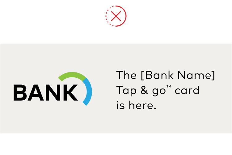
- The “tap & go” phrase cannot be used as a program name nor can it be paired directly with a bank or other payment brand name, rather, it can be used in verb form to enhance communications.
- The Contactless Indicator may be used adjacent to the Mastercard®/Maestro® branding provided the minimum clear space is met as described.
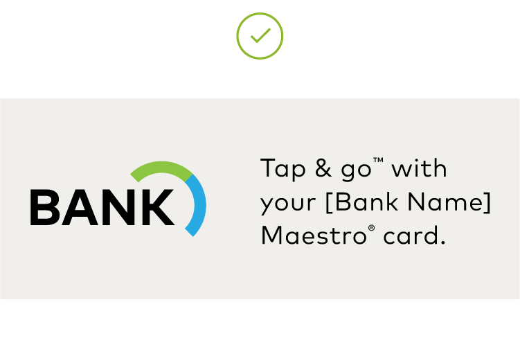
Examples of consumer-facing messaging
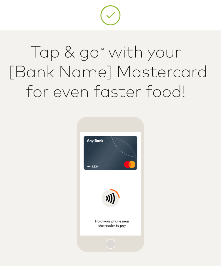
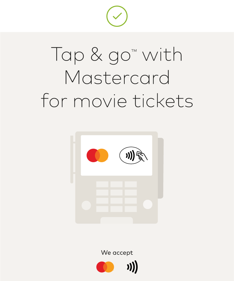
- Tap & go™ with Mastercard.
- Tap & go™ with your [Bank Name] Mastercard®/Maestro® card.
- [Bank Name] Mastercard®/Maestro® card featuring tap & go™ payments.
Introduction
Mastercard Merchant Presented QR is a consumer-initiated, push payment transaction with a mobile payment device through a low-cost point of interaction device. An originating institution must enroll with Mastercard to participate in Mastercard Merchant Presented QR and offer this acceptance option to merchants.
This section includes requirements for the use of QR branding assets in a Mastercard Merchant Presented QR payment flow, including:
- Use of the EMV® QR Payment Mark for QR payment point-of-sale (POS) acceptance on mobile phones, other payment and non-payment form factors, and within supporting marketing collateral.
- Partners, service providers, and their developers when integrating QR branding assets into their mobile banking environment.
Merchants and originating institutions participating in Mastercard Merchant Presented QR are not required to execute the EMVCo licensing agreement for use of the EMV QR Payment Mark. The Mastercard license is sufficient. EMVCo standards are available at https://www.emvco.com.
QR branding assets
EMV® QR Payment Mark
- Is an EMV trademarked stylization of a QR (Quick Response) code and focus frame used to signal universal QR acceptance
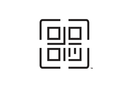
- Must be used to represent QR transaction capabilities in mobile and digital applications, and in marketing collateral and POS signage
- Must not be altered in any way
- Is available in positive and reverse versions
Color
- When printing the QR Payment Mark, it must appear in solid black, a tint of black, or white, whichever provides sufficient contrast against background.
- When one-color printing is the only option, the EMV QR Payment Mark must appear in the same color as the text.
Minimum clear space
- Surround the QR Payment Mark with sufficient clear space.
- On mobile devices, or equivalent form factors (where space may be extremely limited) the clear space requirement above does not apply in full—in these instances, the minimum clear space required around all four sides of the QR Payment Mark is 6 pixels/12 points on screen or 2mm/.08in for print.

Size requirements
- The QR Payment Mark must appear at a size equal to the other payment marks displayed.
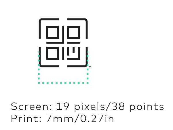
- The QR Payment Mark must appear at a height no smaller than 19 pixels/38 pts on screen or 7mm/0.27in for print.
- On extremely small form factors (i.e., wearables), the QR Payment Mark must appear at a height no smaller than 14 pixels/28 points on screen or 5mm/0.19in for print.
The Mastercard Merchant Presented QR Mark
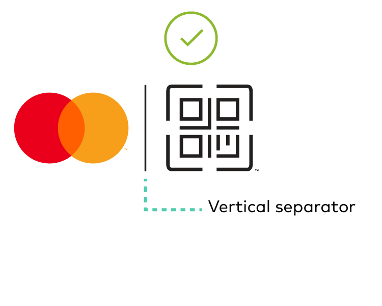
- Is used to promote Mastercard Merchant Presented QR functionality in marketing collateral and point-of-sale signage
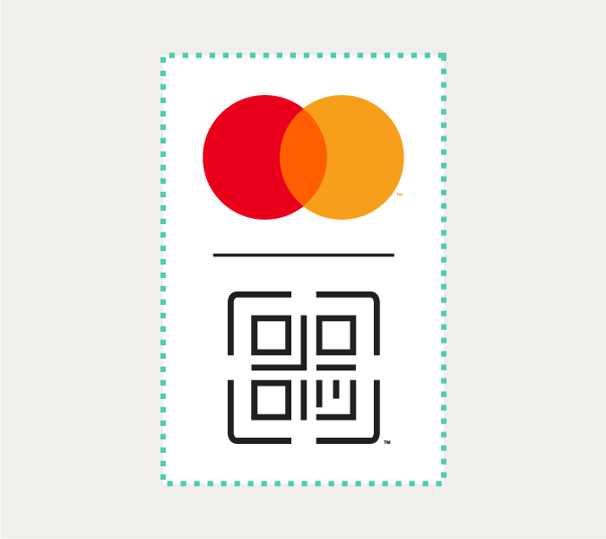
- Is made up of a combination of the Mastercard Symbol and EMV® QR Payment Mark separated by a vertical or horizontal line
- Is available in horizontal and vertical configurations, and in positive and reverse versions
- Must be built from Mastercard-provided templates

Trademark designations
- Trademark designations are not required to appear next to the Mastercard Symbol when used on small-scale digital interfaces and marketing collateral.
- Trademark designations must be used with the Mastercard Merchant Presented QR Payment Mark regardless of reproduction size.
Color
- The Mastercard Symbol must be used in full-color on digital user interfaces and in marketing. When only one-color printing is available, or when all other payment options appear in grayscale or solid, use the grayscale or solid Mastercard Brand Mark version of the mark.
- Sufficient contrast between the background and the Mastercard Merchant Presented QR Mark is required.
Illustrative, but not exhaustive, examples of compliant and non-compliant displays follow.





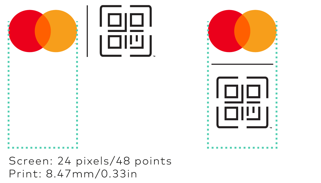
Minimum size
- Reproduce the Mastercard Merchant Presented QR Mark at a size that is clear and legible (varies depending on screen/print resolution).
Minimum clear space
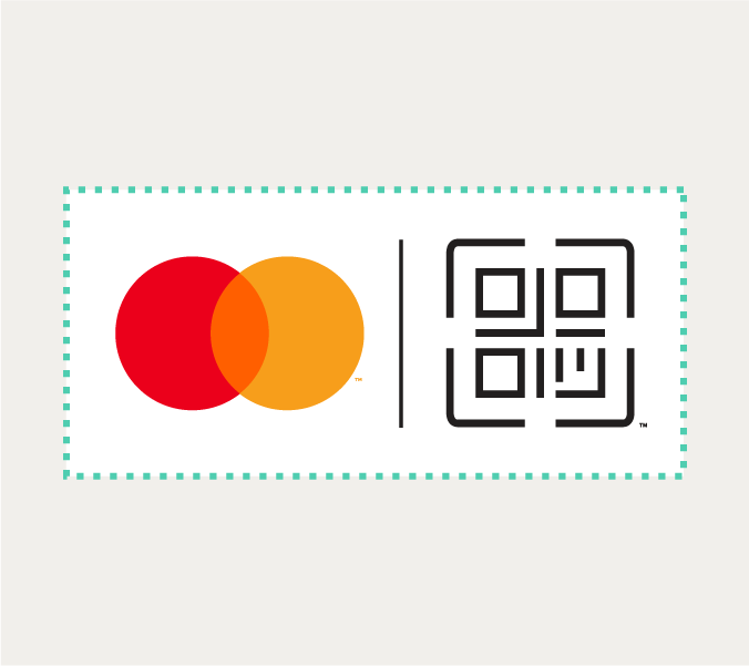
- Always surround the Mastercard Merchant Presented QR Mark with sufficient clear space.
How to obtain artwork
The artwork (ai, svg, and png) may be downloaded by clicking directly on the links below.
Originating Institution branding requirements
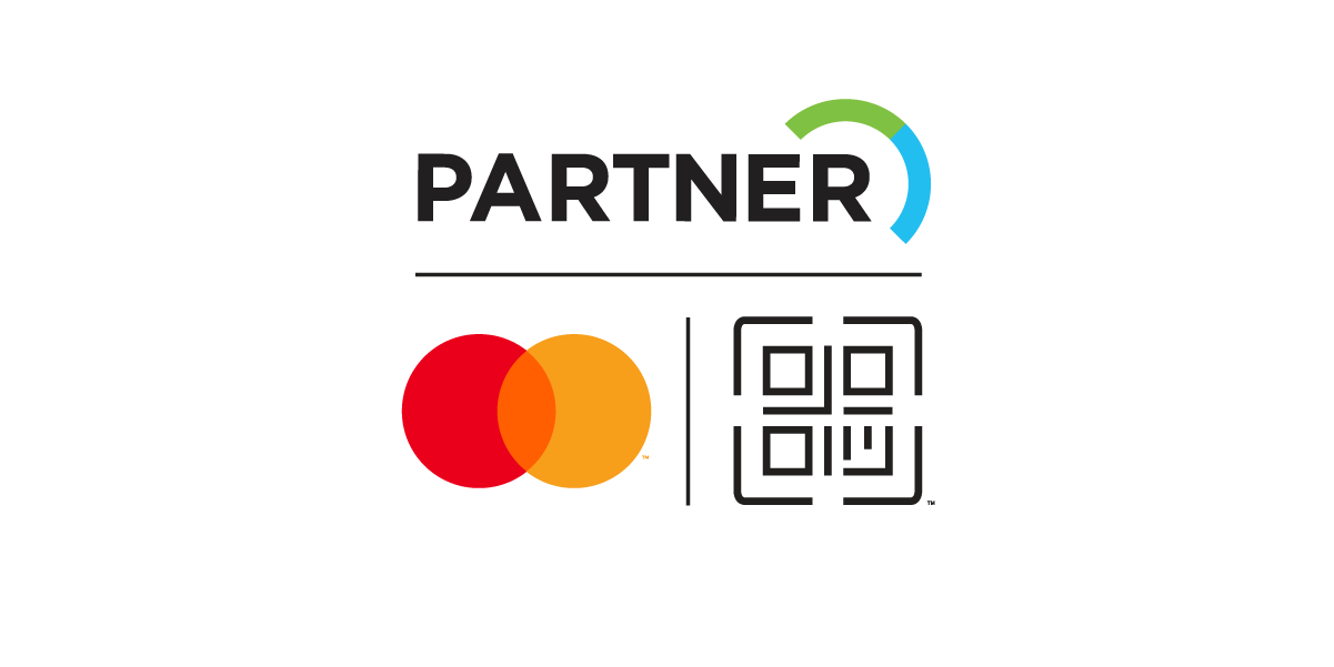
The Partner/Mastercard QR Composite
- Is used by originating Institutions to signal their participation in Mastercard Merchant Presented QR
- Is made up of a combination of the partner or merchant logo, the Mastercard Symbol, and the QR® Payment Mark at size and color parity
- Is available in horizontal and vertical configurations, and positive and reverse versions
- Must be built from Mastercard-provided templates
- Must only be used in marketing communications. The Composite must not be used in any user interface, unless it serves a marketing purpose.

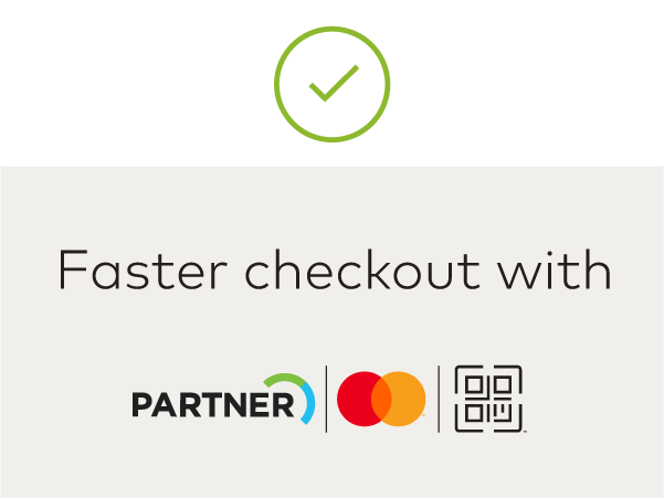
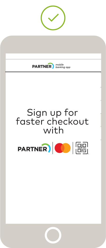
Illustrative, but not exhaustive, examples of compliant and non-compliant displays follow.
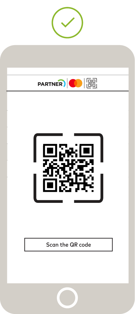
Trademark designations
Trademark designations are not required to appear next to the Mastercard Symbol when used on small-scale digital interfaces and at very small sizes on marketing collateral.
Trademark designations are required next to the QR Payment Mark regardless of reproduction size.
Color
Refer to the color specifications for the Mastercard Merchant Presented QR Mark.
Minimum size
Reproduce the Partner/Mastercard QR Composite at a size that is clear and legible (varies depending on screen/print resolution).
Minimum clear space
Always surround the Partner/Mastercard QR Composite with sufficient clear space.
Branding for the point of sale
Merchant acceptance
- The Mastercard® Symbol, and other applicable network branding, plus the EMV® QR Payment Mark must appear on supplemental door signs, window clings, tent cards, or other site signs to indicate merchant acceptance of QR payments.
- Point-of-sale signage must be used to supplement the required display of acceptance marks at Mastercard merchant locations also enabled for QR payments.
- Acceptance marks must appear in positive or reverse, provided there is sufficient contrast against the background.
- Refer to Using with other payment options and access marks for display requirements with other acceptance marks.
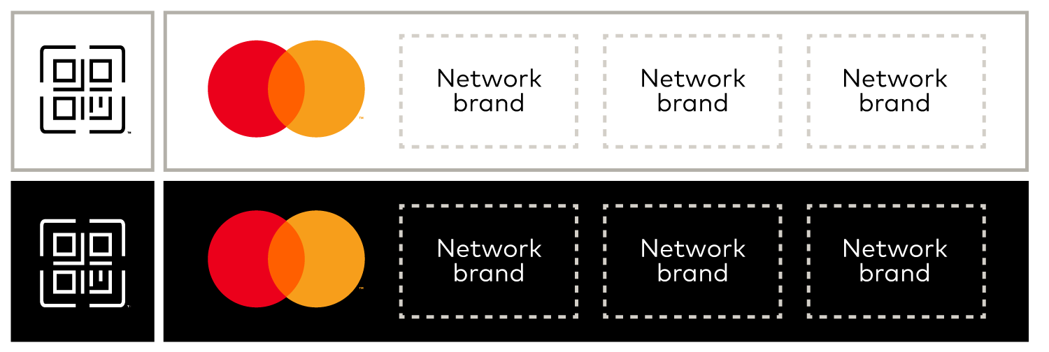
Point-of-sale functional messaging
- When used to signal acceptance or within QR collateral, functional messaging must be shown with the QR® Payment Mark for the sole purpose of indicating that QR payments are accepted.
- Acceptable language includes “Scan to pay,” “Scan,” “[QR] accepted”, “[QR]accepted here”, “Pay with [QR]”, or a local language equivalent.
Generating a functional QR code image
When generating a functional QR code image:
- The code must be in black on a white background.
- The QR code display zone must be sized at least 35% of the screen/page size.
- The target display size and resolution determines whether image scaling is required.
- The size of each QR code module (in pixels), determines the output size; generally 5 pixels/module is sufficient.
- When image scaling, choose a scaling algorithm that produces the least distortion and artifacts.
- The number of pixels must be reasonably high (that is, proportional to the hardware capability of the consumer device) to reproduce an image with good clarity.
- Partner logos of any kind are not permitted to be embedded in the QR code.
Illustrative, but not exhaustive, examples of compliant and non-compliant displays follow.
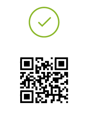
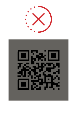


Merchant transactional signage
Transactional signage is required to appear at the point-of-interaction/sale (POS) by merchants participating in Mastercard Merchant Presented QR to promote usage and enable the customer to initiate the QR payment process.
QR transactional signage
- Is used to indicate acceptance of Mastercard Merchant Presented QR as well as to enable the customer to initiate the payment process through the scanning of the QR code
- Must be displayed prominently and in close proximity to the merchant terminal, either affixed directly to the terminal or in some form (i.e., sticker or sign) positioned adjacent to it.
- Must include Mastercard Merchant Presented QR Mark, functional messaging (optional), merchant’s own QR code, merchant account number, merchant and acquirer branding (Merchant ID/alias when applicable, i.e., feature phones).
- Must be reproduced in full color, unless when technical limitations prohibit the use of full color, use the grayscale or solid Mastercard Brand Mark version of the mark.
- Instructional messaging such as “scan to pay” or local language equivalent is optional.
Illustrative examples of compliant displays follow.
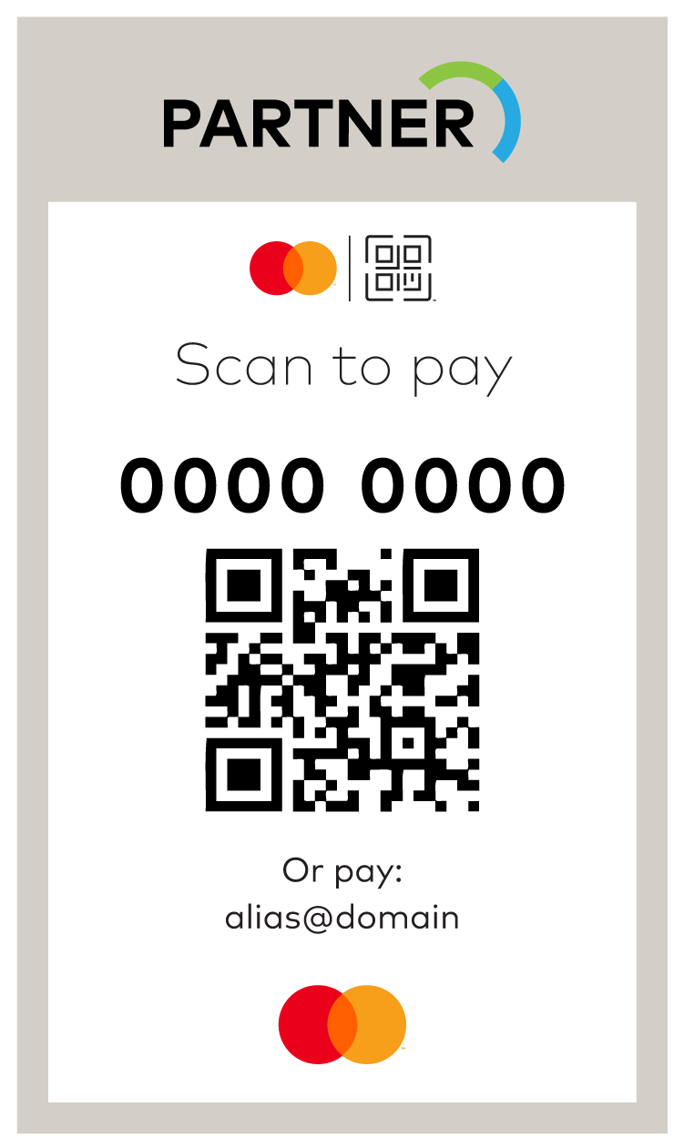
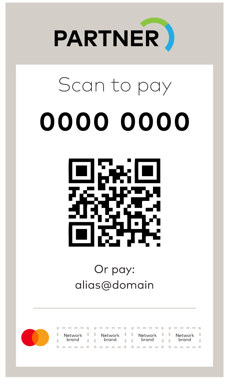
Interoperable QR transactional signage
- Acceptance marks must be displayed at parity (in terms of size, frequency, color treatment, and location) with all other acceptance marks displayed , with Mastercard preferably in the first position. Refer to Using with other payment options and access marks.
- The Mastercard Symbol must be reproduced in full color. When technical limitations prohibit the use of full color, use the grayscale or solid Mastercard Brand Mark version of the mark.
- Must include the EMV® QR Payment Mark, all accepted acceptance marks, merchant’s own QR code, merchant account number, merchant and acquirer branding.
- Instructional messaging such as “scan to pay” or local language equivalent is optional.
- Is used to indicate that a merchant accepts multiple brands for QR payment.
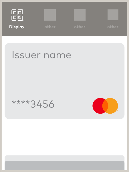
Branding in digital QR devices
- When a Mastercard account is represented in a QR digital screen display such as a digital wallet or other digital application, the Mastercard digital branding guidelines must be followed.
- Refer to the Use in digital payments for additional branding guidelines on digital devices.
- QR devices that contain consumer-facing payment screen display interactions must include:
- The Mastercard Symbol or a Mastercard card image
- The last four digits of the account number
- Mastercard branding must appear within the QR payment screen user interface when:
- Selecting card account/credentials for payment.
- Displaying QR code for payment. The generated QR code and Symbol size must follow the specifications.
- When confirming the use of card account/credentials in a transaction and showing the transaction history, it must include details of the card used, merchant name, transaction amount, and transaction time/date.
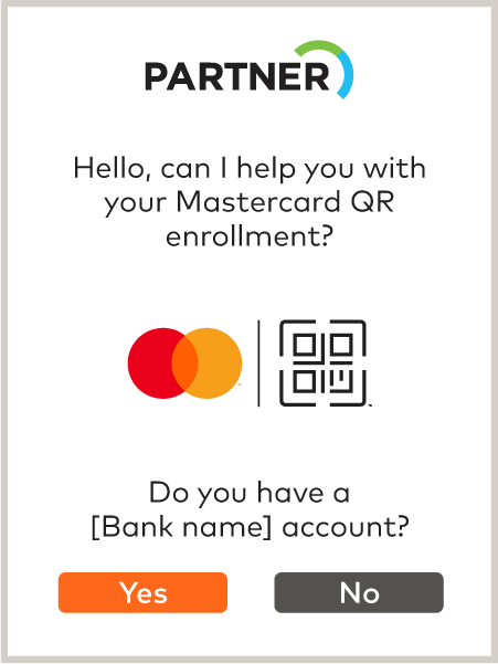
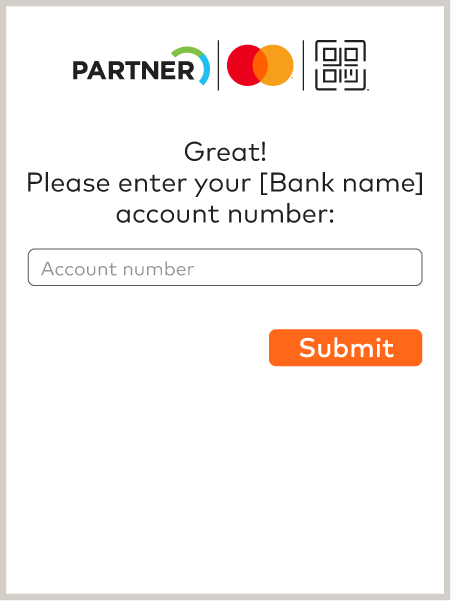
- Mastercard QR branding must be present when exiting a chatbot to enter the receiving institution landing screen upon login or sign up.
- Mastercard QR branding must be present in subsequent screens if the merchant is required to sign up for an account.
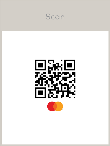

Functional messaging
- Acceptable language for merchant-presented QR includes “Scan,” or local language equivalent.
- Any functional messaging used must not interfere with the visibility or integrity of the EMV QR Payment Mark and must follow the clear space requirements.
Use in marketing and collateral
- Licensees (such as Merchants and Originating Institutions) may display the QR Payment Mark in marketing support of their QR code product or service, provided the use standards are followed and the following trademark attribution language is included where space permits: “The QR Payment Mark, consisting of a stylized QR code, is a trademark owned by and used with permission of EMVCo, LLC.”
- The QR Scan Icon does not require trademark attribution language.
- When describing the QR Payment Mark in text:
- The complete name “EMV® QR Payment Mark” must be used in the first or most prominent mention.
- Thereafter, the shorthand “QR Payment Mark,” or “QR Mark,” is acceptable.
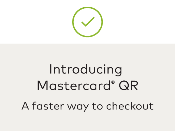
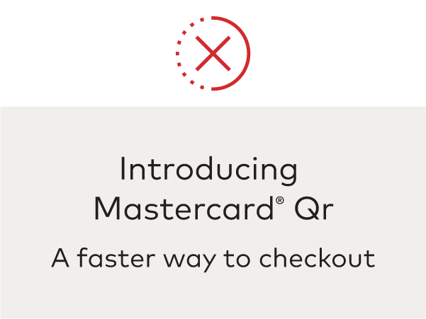
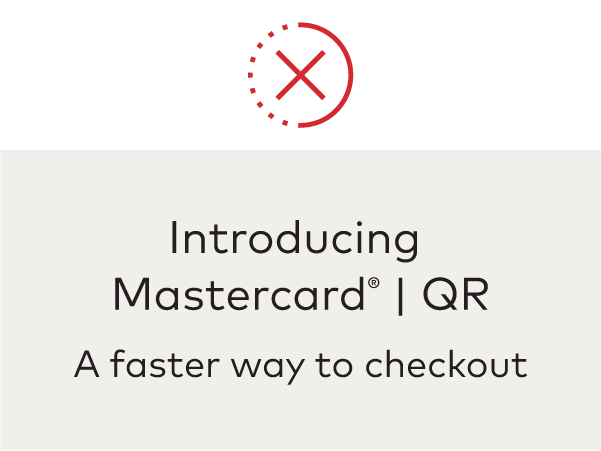
- When describing Mastercard® QR or Partner/Mastercard QR in text, the complete name “Mastercard® QR” must be used in all mentions.
- The above naming must be typeset in the same typeface as the surrounding copy, as a single word with no space between “Master” and “card”, use an uppercase “M” and lowercase “c”, and “QR” must be in uppercase.
- Do not include a separating line between the partner name, “Mastercard,” and “QR”.
- In B2B communications, the product is referred to as “Mastercard Merchant-Presented QR”.
- For use of the Mastercard name in text refer to Using the Mastercard name in text.
Illustrative, but not exhaustive, examples of compliant and non-compliant displays follow.
All ATM locations must display the appropriate decal sticker for the brands which are accepted on or near the main entrance. Mastercard, Maestro, and/or Cirrus branding may also appear on ATM screens.
Decal stickers must be:
- Clearly visible on or near the cash machine and must not appear only on the ATM screen.
- Displayed horizontally or vertically following the approved sequence: Mastercard, Maestro, Cirrus, along with other payment options or access marks displayed.
- Displayed at parity (in terms of size, frequency, color treatment, and location) with all other acceptance marks displayed.
- Displayed with similar prominence to any access mark displayed (characteristics to consider for similar prominence, include size, frequency, color treatment, and co-location within the same field of vision).
The Mastercard Checkout Sound and Animation (which is only applicable with Mastercard branding) may be played and/or displayed on the ATM screen as a form of confirmation. Please contact your Mastercard representative or contact us for more information.
Illustrative, but not exhaustive, examples of compliant and non-compliant displays follow.


Note: Non-compliant examples become compliant when Mastercard branding is added to the display in compliance with Using with other payment options and access marks* (e.g., (1) with acceptance marks, adding Mastercard, Maestro, and/or Cirrus branding at parity with size, frequency, color treatment, location, and prominence equal to that of all other acceptance marks and (2) with access marks, adding Mastercard, Maestro, and/or Cirrus branding with similar prominence to any access mark displayed (characteristics to consider for similar prominence, include size, frequency, color treatment, and co-location within the same field of vision)).
Note: Gray boxes in the examples of displays represent a payment option or access mark, as applicable. As used on brand.mastercard.com, an access mark is any name, logo, sound, haptic, visual depiction, trade name, logotype, trademark, service mark, trade designation, and/or other designation, symbol or mark not licensed by Mastercard, that identifies a service through which a Mastercard, Maestro, or Cirrus account can be accessed and/or accepted for a Mastercard, Maestro, or Cirrus transaction.
*With the exception of Mastercard in the U.S. Region and U.S. Territories, where a specific regional Standard that permits otherwise exists. Refer to Mastercard Rules, Rule 5.12.1 “Discrimination” of Chapter 16, “Additional U.S. Region and U.S. Territory Rules”.
Consistent presentation of Mastercard® branding benefits issuers, acquirers, and merchants, by promoting consumer recognition and card use that builds business. Here are some common mistakes to avoid:


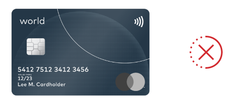

Maestro Branding Requirements
1. Choose the correct Maestro branding (“logo”) for your specific use. See Configurations for more guidance.
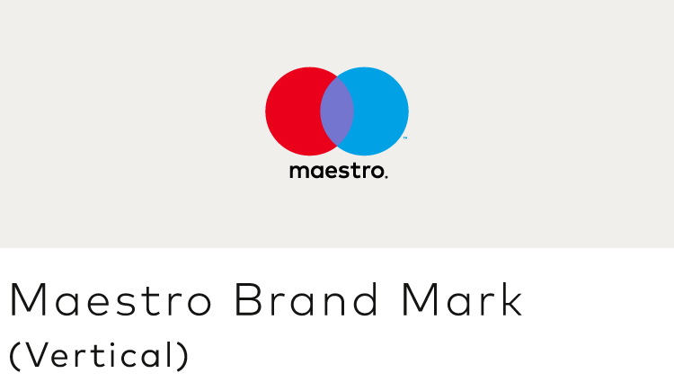
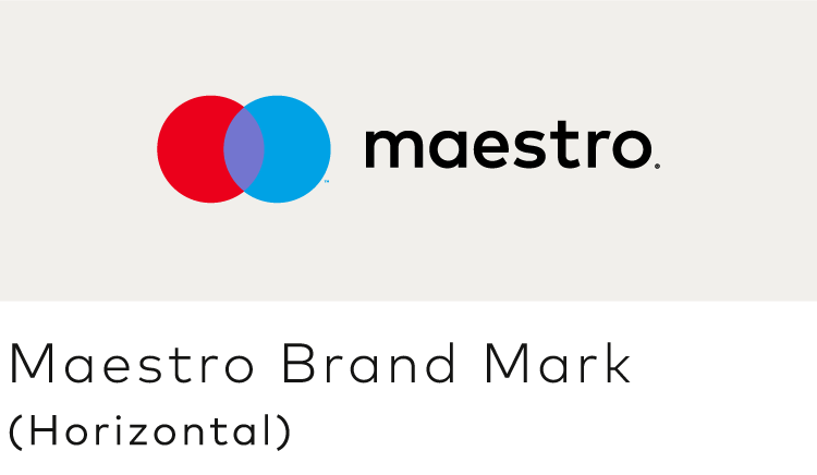
2. Always provide sufficient contrast with the background. See Background contrast.






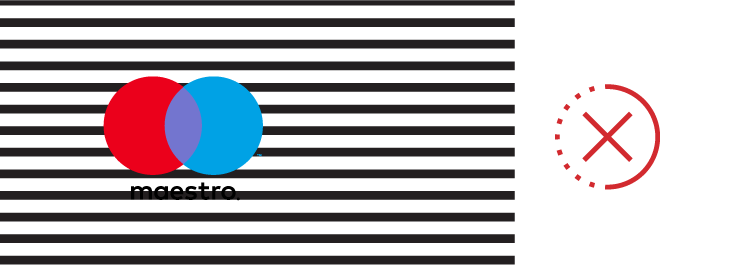

3. Always surround the logo with sufficient clear space. See Minimum clear space.

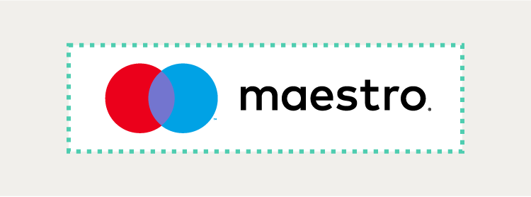
4. For cards, please get guidelines and artwork from the Card Design Standards at mastercardconnect.com
5. Always reproduce the logo at a size that is clear and legible. See Minimum size.
6. When referencing Maestro® in text, use an uppercase “M”. See Using the Maestro name in text.
7. The Maestro Brand Mark must always include the word “maestro”. There is no symbol-only version of the Brand Mark.



Maestro Brand Mark
The Maestro Brand Mark is comprised of the Maestro circles and associated trademark symbol ™ and the word “maestro” followed by a registered trademark symbol ®. The Maestro Brand Mark is used in materials created by Mastercard, its issuers, acquirers, and co-brand partners to market and promote Maestro products and services.
- The Maestro Brand Mark is available in both vertical and horizontal configurations. Use the one that best fits your needs.
- Full-color, grayscale, and solid versions are available for use on white or light backgrounds (“positive”) and black or dark backgrounds (“reverse”). See Color specifications.
- Grayscale and solid versions must never be used on the chip side for physical cards or the visible side when a card is represented visually in any digital payment environment.
- Artwork is available for download and must not be altered.
- Download artwork for acceptance and marketing here.
- Download artwork for cards at mastercardconnect.com.
VERTICAL CONFIGURATION
HORIZONTAL CONFIGURATION


Note: The ™ and / or ® trademark symbols (or other symbol required under local law) must be used. They must remain at the relative size provided in the authorized artwork files and be scaled proportionally with the marks even though their legibility may be compromised when the marks are at very small sizes or reproduced in certain media. The trademark symbols (or other symbol required under local law) must not be enlarged independently to increase legibility.
Decal stickers
- The decal sticker (also known as the “Acceptance mark”) is comprised of the Maestro Brand Mark on a black background.
- Decal stickers and other signage must not be printed in grayscale.
- Decal stickers are physically printed signage used to signify acceptance at retail locations such as on door decals, card terminals, or ATMs.
- Artwork is available for download and must not be altered.
- The Maestro Brand Mark is available in full-color, grayscale, and solid versions. The solid version may appear in black, white, or any single color (provided there is sufficient contrast to the background).
- On physical cards, the Maestro Brand Mark must be printed in full-color match PANTONE®* only. For more details, refer to the Card Design Standards published on mastercardconnect.com
- When depicting cards in digital payments/wallets, the, Maestro Brand Mark must always appear in full color using the RGB or Hex values provided below.
- The decal sticker is available in full-color only and must be reproduced in full-color match PANTONE only.
- Colors are built into the downloadable artwork files and must not be altered.
COLOR
RGB: 235/0/27
HEX: EB001B
CMYK: 0/100/98/3
PANTONE: 2035 C
Maestro Purple
RGB: 115/117/207
HEX: 7375CF
CMYK: 59/54/0/0
PANTONE: 272 C
Maestro Blue
RGB: 0/162/229
HEX: 00A2E5
CMYK: 82/8/0/0
PANTONE: 299 C

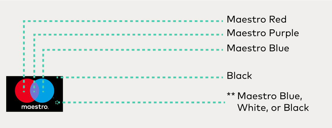
GRAYSCALE AND SOLID
CMYK: 0/0/0/75
Maestro Medium Gray
CMYK: 0/0/0/52
Maestro Light Gray
CMYK: 0/0/0/28
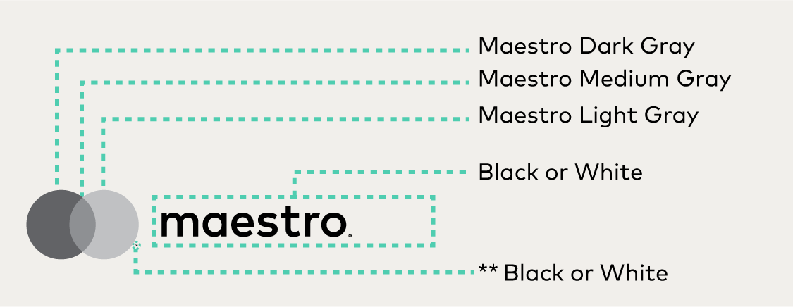
Note: Color specifications apply to vertical configurations as well.
* The color values shown here have not been evaluated by Pantone, Inc. for accuracy and may not match the PANTONE Color Standard. Consult correct PANTONE Color Publications for accurate color. PANTONE® is the property of Pantone, Inc.
** For online/digital RGB use or PANTONE printing, the trademark symbol (™) next to the blue circle must be reproduced in Maestro Blue. For CMYK printing, the trademark symbol (™) must be black for the positive mark or white for the reverse mark. For all uses, the registered trademark symbol (®) to the right of the word “maestro®” must be black for the positive mark or white for the reverse mark.
To ensure legibility of Maestro branding, never use the logos at sizes smaller than the minimum size requirements.
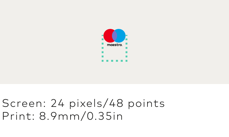
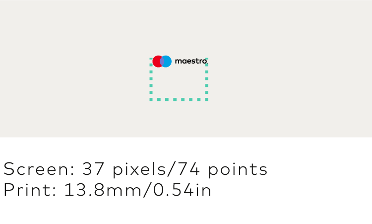
Maestro branding must appear in an uncluttered space free from text and other graphics.
- Surround the vertical Maestro Brand Mark with clear space of at least ¼ the width of one of the circles.
- Surround the horizontal Maestro Brand Mark with clear space of at least ½ the width of one of the circles on the left and right sides, and ¼ the width of one of the circles on the top and bottom.


Sufficient contrast between the background and the Maestro branding is required.


Lettercase
When referencing Maestro® in text, use an uppercase “M”. Maestro must appear in the same font as its surrounding text. The name must not be modified in any way. The name may appear in all uppercase letters only if the font style of the user interface or communication also appears in all uppercase letters.


Registered trademark symbol (®)
In the first or most prominent text use of the word “Maestro” on a page or screen (after use, if any, in a headline), the ® trademark symbol (or other symbol required under local law) is required. In subsequent use on that page or screen, the ® trademark symbol may be omitted.
Read-through
Maestro branding may be used as a read-through in a headline, but may not be used as a read-through in the body of a communication. When used in text, it must be set in the same typeface as the surrounding text.

Trademark attribution notice
When the Maestro name and/or Maestro Brand Mark are used, the following trademark attribution notice must be included once in the communication:
- “Maestro and the circles design are registered trademarks of Mastercard International Incorporated or its affiliates.”
Note: On digital communications and small-size marketing communications, the above trademark attribution notice is not required.
Translations
The Maestro name must appear in English only. The Maestro name must not be translated into other languages nor appear in another alphabet except for specific authorized versions in Chinese (translation), Arabic (transliteration), and Georgian (transliteration).
Parity
In communications that promote more than one acceptance mark, the Maestro name and/or branding must be presented with size, frequency, color treatment, location, and prominence equal to that of all other acceptance marks and/or logos presented.
Note: As used on brand.mastercard.com, an access mark is any name, logo, sound, haptic, visual depiction, trade name, logotype, trademark, service mark, trade designation, and/or other designation, symbol or mark not licensed by Mastercard, that identifies a service through which a Mastercard, Maestro, or Cirrus account can be accessed and/or accepted for a Mastercard, Maestro, or Cirrus transaction.
All Maestro® branding, including the decal stickers, must be displayed at the point of interaction where payment options and/or access marks are presented.
At the point of interaction, Maestro branding must be displayed at parity (in terms of size, frequency, color treatment, and location) with all other acceptance marks displayed. If both Mastercard and Maestro branding are present, Mastercard must appear in the first position and Maestro in the second position.
At the point of interaction, Maestro branding, including the decal stickers, must be afforded similar prominence to any access mark displayed (characteristics to consider for similar prominence, include size, frequency, color treatment, and co-location within the same field of vision), except in the e-commerce environment as follows. In a digital environment, when displaying an access mark checkout option, Maestro branding is not required to be displayed if (1) the cardholder can readily navigate from the screen displaying the access mark checkout option to a screen displaying a checkout option where the Maestro branding is appropriately displayed or (2) Maestro branding is appropriately displayed prior to payment confirmation, when use of an access mark checkout option is the only available checkout option. Access mark marketing materials (i.e., promotional signage, checkout lane dividers, etc.) are not required to include Maestro branding.
Illustrative, but not exhaustive, examples of compliant displays follow.
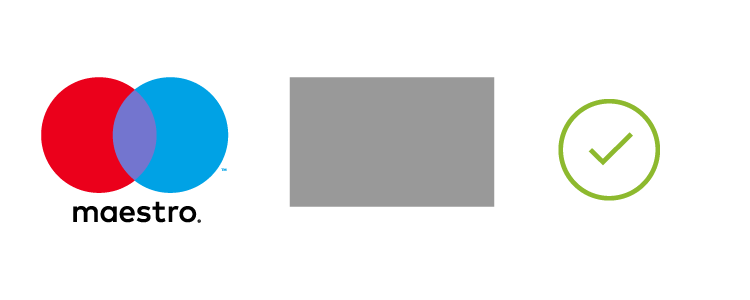

Note: All point of interaction (POI) locations that accept Maestro must display a Maestro Mark at parity (in terms of size, frequency, color treatment and location) with all other acceptance marks (with the exception of Mastercard POI locations in the U.S., where a specific regional Standard that permits otherwise exists. Refer to Mastercard Rules, Rule 5.12.1 “Discrimination” of Chapter 16, “Additional U.S. Region and U.S. Territory Rules”).
Note: Gray boxes in the examples of displays represent a payment option or access mark, as applicable. As used on brand.mastercard.com, an access mark is any name, logo, sound, haptic, visual depiction, trade name, logotype, trademark, service mark, trade designation, and/or other designation, symbol or mark not licensed by Mastercard, that identifies a service through which a Mastercard, Maestro, or Cirrus account can be accessed and/or accepted for a Mastercard, Maestro, or Cirrus transaction.
Use at physical merchant locations
For complete information, refer to Use at physical merchant locations.
Use at digital merchant locations
For complete information, refer to Signaling digital payment acceptance.
Mastercard family of brands
When more than one Mastercard brand is accepted, display the marks horizontally or vertically in the approved sequence:
- Mastercard®
- Maestro®
- Cirrus®
Refer to the Other Marks section for artwork and requirements.
Refer to the Card Design Standards published on mastercardconnect.com
All use of card images in marketing materials must comply with the requirements specified in the Card Design Standards manual published on mastercardconnect.com, and the requirements below:
- The card image must include Maestro Brand Mark on the chip side for physical cards or the visible side when a card is represented visually in any digital payment environment in compliance with the Card Design Standards in full-color and at the exact size as it would appear on the actual card plastic.
- The entire chip side for physical cards or the visible side when a card is represented visually in any digital payment environment (including the entire Maestro branding) must be fully visible, clear, and legible.
- The display of account information is optional. If included, the account information (the Primary Account Number (PAN), the effective date and/or expiration date, and the cardholder name) and all card face design requirements must be in accordance with the requirements set forth in the Card Design Standards.
- When a cardholder name is present on the card image, the issuer must use the name M. Molina in the Latin America and the Caribbean Region or the name Lee M. Cardholder or John M. Cardholder in all other Regions.
- When a PAN is present on the card image:
- Either a BIN assigned to the issuer by Mastercard or 012345 followed by any combination of digits up to 16 digits must be present on the card image.
- Card images must be present at a size that is clear and legible.
- When a card image is not present, or the issuer name/logo does not appear on the card image, the following statement must appear on the marketing material in a location chosen by the issuer: “This card is issued by [Full Issuer Name] pursuant to license by Mastercard International Incorporated.”
- Maestro cards must be depicted at parity (in terms of size, frequency, color treatment, and location) with all cards depicted in the same communication. Refer to Using with other payment options and access marks.
- The full Maestro program name must be used in the first occurrence (e.g., [Issuer Name] [Co-brand Partner Name] Maestro®).
- After the first occurrence, the full Maestro program name may be abbreviated to “Maestro” or the issuer or co-brand partner name (e.g., [Issuer Name] Maestro®) in subsequent occurrences within the same communication, and must appear in the same font as the surrounding text.
- The word “card” must not be a part of a card program name, e.g., [Issuer Name] Maestro® is correct and [Issuer Name] Maestro® Card is not correct). However, when you are referring to the “card” in marketing materials, the word “card” is recommended to be included (e.g., “Your [Issuer Name] Maestro® card has a host of benefits.” or “Your [Issuer Name] Maestro® has a host of benefits.”).
- Mastercard-provided program identifier artwork used on cards (as defined in the Card Design Standards) must not be used in marketing materials except when being displayed on a card image.
Illustrative examples of compliant displays follows.
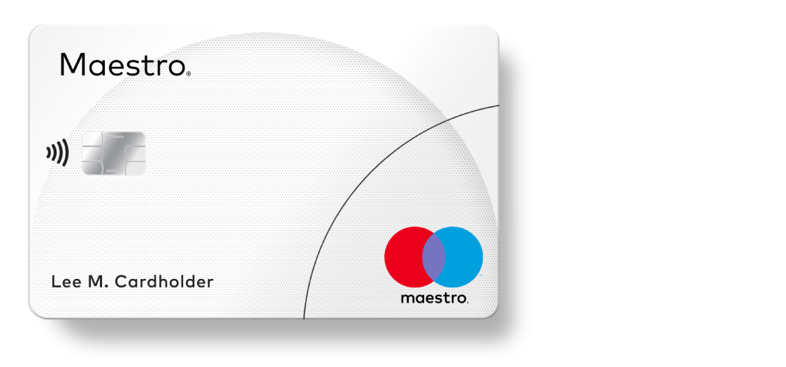
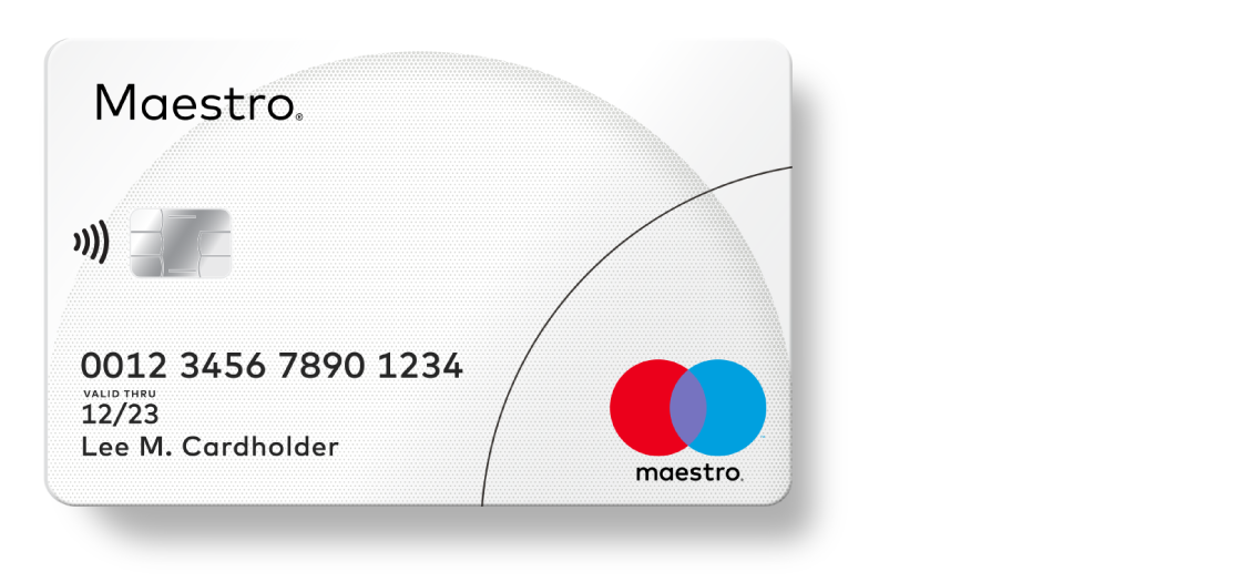
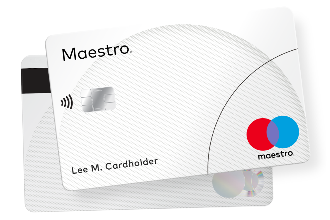
Illustrative examples of non-compliant card images follows.

At entry into a merchant location
Display the Maestro® decal sticker on a main entry door or on a nearby window to signal acceptance. If these locations are not available, the decal sticker must be displayed so it is seen easily from the outside. Illustrative, but not exhaustive, examples of compliant and non-compliant displays follow.
Note: For merchant decal stickers, the primary source to receive decals is the financial institution that processes the merchant’s transactions. However, for convenience, merchants may download artwork to create custom signage or order limited quantities from Mastercard.


Note: Non-compliant example becomes compliant when Maestro branding is added to the display in compliance with Using with other payment options and access marks* (e.g., (1) with acceptance marks, adding Maestro branding at parity with size, frequency, color treatment, location, and prominence equal to that of all other acceptance marks and (2) with access marks, adding Maestro branding with similar prominence to any access mark displayed (characteristics to consider for similar prominence, include size, frequency, color treatment, and co-location within the same field of vision)).
Note: Gray boxes in the examples of displays represent a payment option or access mark, as applicable. As used on brand.mastercard.com, an access mark is any name, logo, sound, haptic, visual depiction, trade name, logotype, trademark, service mark, trade designation, and/or other designation, symbol or mark not licensed by Mastercard, that identifies a service through which a Mastercard, Maestro, or Cirrus account can be accessed and/or accepted for a Mastercard, Maestro, or Cirrus transaction.
At the point of interaction
Also display Maestro branding at the point of interaction (POI) to encourage card use. Examples of POI branding include: cash register, terminal display, digital display, tent cards, card presenters, etc.
- Physical decal stickers may be used on cash registers and terminals.
- For digital cash register or terminal displays, optimized artwork is available for download.
Illustrative, but not exhaustive, examples of compliant and non-compliant displays follow.


Note: Non-compliant example becomes compliant when Maestro branding is added to the display in compliance with Using with other payment options and access marks* (e.g., (1) with acceptance marks, adding Maestro branding at parity with size, frequency, color treatment, location, and prominence equal to that of all other acceptance marks and (2) with access marks, adding Maestro branding with similar prominence to any access mark displayed (characteristics to consider for similar prominence, include size, frequency, color treatment, and co-location within the same field of vision)).
Note: Gray boxes in the examples of displays represent a payment option or access mark, as applicable. As used on brand.mastercard.com, an access mark is any name, logo, sound, haptic, visual depiction, trade name, logotype, trademark, service mark, trade designation, and/or other designation, symbol or mark not licensed by Mastercard, that identifies a service through which a Mastercard, Maestro, or Cirrus account can be accessed and/or accepted for a Mastercard, Maestro or Cirrus transaction.
*With the exception of Mastercard in the U.S. Region and U.S. Territories, where a specific regional Standard that permits otherwise exists. Refer to Mastercard Rules, Rule 5.12.1 “Discrimination” of Chapter 16, “Additional U.S. Region and U.S. Territory Rules”.
For information on using the Maestro brand in digital payments, refer to the Use in digital payments section of the Branding Requirements.
For information on using the Maestro brand in Click to Pay enablement, refer to the Signaling Mastercard Click to Pay enablement section of the Branding Requirements.
For information on using the Maestro brand on ATMs, refer to the Use on ATMs section of the Branding Requirements.
For information on using the Maestro brand on contactless devices, refer to the Use in contactless payments section of the Branding Requirements.
Consistent presentation of Maestro® branding benefits issuers, acquirers, and merchants, by promoting consumer recognition and card use that builds business. Here are some common mistakes to avoid:


